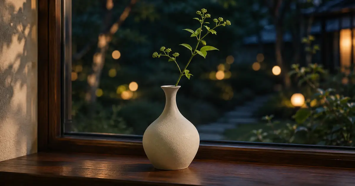

You blur the background, but the photograph still feels busy. Bright circles compete with the face, a lamp sits directly behind the bottle cap, or every leaf becomes a small outlined ring. The background has lost detail without becoming easier to look at.
That is why I separate how much blur an image has from what that blur looks like. Bokeh describes the character of out-of-focus rendering. Background blur describes the loss of detail behind the subject. You can have plenty of the second and still dislike the first.
What bokeh changes in a photograph
Canon's bokeh introduction distinguishes the appearance of blur from blur itself. Look at an out-of-focus light: its edge might fade gently, form a bright rim, or make a recognizable polygon. Those differences help explain why two similarly soft backgrounds can feel different.
Bokeh is not limited to the familiar string of round lights. It also shows up in the way overlapping branches, foliage, reflections, and foreground details dissolve. Hasselblad's guide to out-of-focus rendering separates that visual character from depth of field, which concerns the range that looks acceptably sharp.
For a product photograph, I would judge those properties in this order: can I read the important product details, does the background support the product, and do the bright spots pull attention somewhere useful? A beautiful blur pattern is a poor trade if the label becomes unreadable.
Compare shapes before comparing lenses
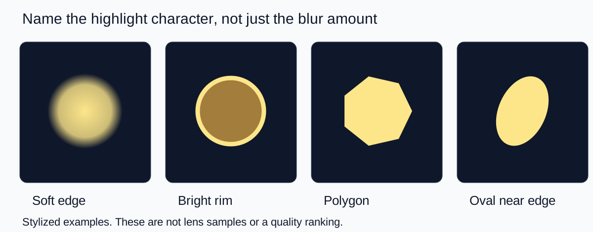
Use the diagram as a vocabulary exercise. “Make it blurrier” asks for a change in amount. “Keep the background lights softly edged and unobtrusive” describes a visual preference. “Move the brightest highlight away from the product name” is a composition instruction. Those requests solve different problems.
I would not use these shapes to identify a particular lens from an image. Aperture, optical design, position in the frame, and editing can all affect the result. A polygon is not automatically a defect, and round highlights are not automatically superior. The question is whether the shape belongs in the image you are making.
A festive portrait may benefit from visible light discs. A clinical skincare product may work better against a restrained tonal gradient. An energetic party scene can tolerate a busy background that would overwhelm a quiet portrait. Start with the mood and the object that needs attention, then decide how much background character to keep.
Run a small background audition
You do not need to buy a new lens to make a useful comparison. Choose a small subject with an identifiable edge and place a few ordinary lights well behind it. Use cool-running lights and keep the setup clear of flammable materials. A distant window reflection or existing garden lighting can work too.
- Make a reference frame. Keep the subject large enough to inspect its critical detail. For a jar, that might be the brand name and the front edge of the lid.
- Change only the background position. Move the lights sideways so that the brightest spot clears the subject's silhouette. Keep the camera and subject still.
- Try a less extreme aperture. If your camera permits aperture control, compare a wider and a narrower setting while keeping overall brightness comparable. Refocus on the same detail.
- Review the full image first. Decide which version communicates the product better at normal viewing size. Then inspect enlarged highlights and edges.
- Keep a setup note. Record the background placement, the focus target, and the setting you changed. This turns a lucky frame into a repeatable choice.
On a phone, compare the standard camera result with any portrait-style effect separately. A software depth effect adds another variable, so I would not treat it as a clean demonstration of the lens alone. Export both versions and check the actual files; a preview can hide changes around thin stems, handles, hair, and transparent glass.
Use a three-part review on the finished crop
| Review | Ask | Useful adjustment |
|---|---|---|
| Subject detail | Is the part that sells the image still sharp? | Change focus or depth of field before adding stronger blur. |
| Highlight placement | Does a bright spot compete with the face or label? | Move the light, subject, or composition. |
| Blur character | Do repeated edges make the background restless? | Try a different background, aperture, or rendering treatment. |
The final crop matters. Imagine a candle beside a window. In a wide image, three distant lights create a gentle rhythm. In a square crop, only one remains, directly above the wick. It now looks like an accidental flame or a distracting bright dot. Nothing about the lens changed; the composition did.
For a portrait, check both the eyes and the outline of the hair. For a product, check the label, cap, handle, and any transparent opening. If the background effect erases a real gap or leaves a pale fringe, you have a selection or depth-boundary problem. The guide to fixing background-blur halos addresses that separate repair task.
Write a more useful AI background brief
I prefer a short visual instruction over a pile of camera terms. Decide which details must survive, where the background sits, and how its highlights should behave. This makes the result easier to approve even when the generator is interpreting a photographic style rather than calculating a real lens.
Keep the supplied vase and its full outline unchanged. Place it on a dark wooden windowsill with a garden far behind it. Use a few small, softly edged warm background lights. Keep the brightest lights away from the rim and stem. The vase texture and stem should remain clear. Preserve the open spaces between leaves; do not blur through the subject.
Try that composition in QuestStudio Image Lab using your own approved reference. Compare two backgrounds with the same subject rather than changing the subject, light, crop, and style at once. You will have a clearer reason for preferring one result.
The hero above is an editorial illustration of this kind of scene, not proof of a particular camera setting. If you need a reliable product record, keep the original photograph alongside the concept. A pleasing background does not establish that generated packaging, fine lettering, or proportions are accurate.
My recommendation: keep enough background to tell the story
For most product and personal-brand images, I would start with moderate separation and a simple background. Increase the effect only when it improves the story. If the image is meant to show a handmade mug in a workshop, some recognizable workshop detail may be more valuable than a completely abstract backdrop.
Save the winning crop and one sentence explaining why it works: “The label stays readable, the highlights avoid the silhouette, and the room still feels warm.” That is a more useful creative standard than “maximum bokeh,” and it gives your next photo or generation a clear target.
Frequently asked questions
Is bokeh the same as background blur?
No. Background blur describes how much detail is lost behind the subject. Bokeh describes the visual character of out-of-focus areas, including highlight edges, shapes, and texture.
Does good bokeh require round light circles?
No. Round highlights are one familiar appearance. A background can have pleasing bokeh without obvious circles, and other shapes may suit the photograph.
Should I always use the widest aperture?
No. Keep the important subject details sharp first. Compare the background at different settings and judge the finished image rather than choosing an aperture only for stronger blur.
Can a phone create a bokeh effect?
A phone can record optical blur and may offer computational depth effects. Inspect the exported image, especially thin details and transparent edges, rather than assuming the preview proves an accurate result.
Why does an AI background look soft but still distracting?
Large bright spots, repeated rings, or awkward placement can compete with the subject even when details are blurred. Adjust the background composition and highlight character before simply increasing blur.
Technical references
Continue with a useful next step
 Image Editing
AI Background Blur: Fix Halos Around Hair and Glasses
Fix AI background blur halos without erasing hair or glasses. Separate mask errors, wrong depth and blur spill, then review a restrained portrait edit.
 Image
Perfume Photography Prompts: Glass, Light, and Reflections
Write perfume photography prompts for clear glass and believable reflections. Compare an original lighting study, plan campaign scenes, and check bottle detail.
 Image
AI Personal Branding Photoshoot: Build a Consistent Set
Plan an AI personal branding photoshoot from an authorized reference. Build a coordinated set, check likeness, and export useful website and social images.
Hero: AI-generated editorial illustration. Supporting diagrams and exercises: QuestStudio.