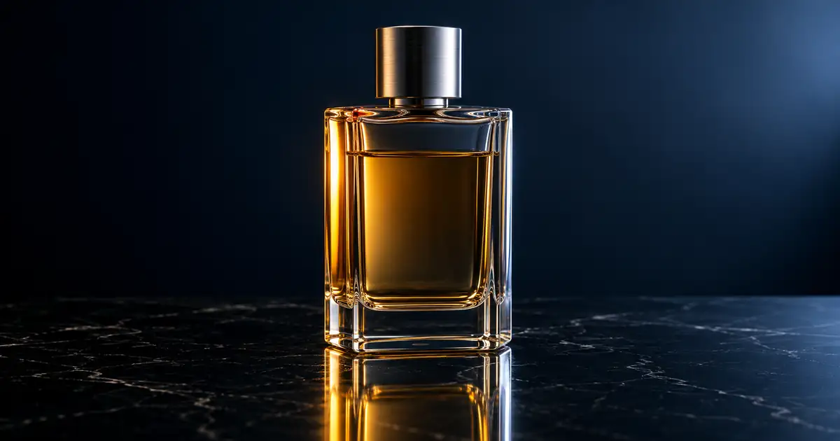

A perfume bottle is a small object with several competing surfaces: transparent glass, colored liquid, a reflective cap, a label, and often a polished base. A prompt that only asks for luxury can make the background attractive while losing the bottle.
Write perfume photography prompts around an approved bottle reference, one lighting idea, and a specific image job. Keep the cap, glass geometry, fill level, and label under review. Build the mood through the setting before asking the product itself to change.
The original lighting study below uses a fictional unbranded bottle. It is a practical comparison of scene directions, not a physical lighting test or proof that a generator can preserve a real fragrance package exactly.
Make the bottle reference unambiguous
Choose a photograph that shows the full bottle, cap, shoulder, base, and important front detail. If the cap is seated, keep that state in the brief. If the bottle is sealed for sale, do not casually introduce a removed cap or atomizer spray in a supporting concept.
Save a second view for checking construction. A straight-on photograph may hide the depth of a rectangular bottle or the shape of its sides. Use the additional view to verify the item, not as permission to invent a dramatic orbit from one picture.
Record the visible liquid level and whether the glass itself is tinted. Amber liquid inside clear glass is a different material arrangement from an amber bottle holding a clear liquid. If that distinction is unclear in the source, improve the source before requesting colored lighting.
Keep exact label information in a separate approved file. Our beauty product photography guide covers capturing package information. This article starts after that factual reference is available.
Compare two lighting directions
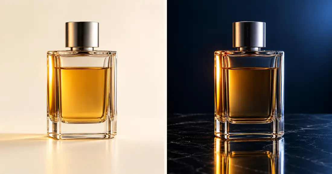
The cream version makes the bottle's body easy to separate from its surroundings. The navy version gives the amber liquid and bright glass edges more visual weight. Those are composition observations, not measurements of physically correct refraction.
The two results also show why mood and accuracy need separate decisions. The liquid looks lighter against cream and deeper against navy. A campaign reviewer must decide whether that appearance still represents the real item. Matching the cap and broad silhouette does not automatically approve every internal reflection.
Download the perfume lighting review sheet. Compare cap, base, fill level, glass edges, and reflection before choosing a preferred background.
Prompt one: a quiet cream studio scene
Use this direction when the bottle needs to be read quickly. Keep the camera near the reference angle and ask for enough contrast to show transparent edges without outlining the entire object in black.
Use the approved perfume bottle photograph as the product reference. Place the same bottle upright on a pale cream matte surface with a simple cream background. Keep the original cap, bottle proportions, thick base, label, and liquid level. Use broad soft side light and restrained dark edge definition so the glass remains transparent and readable. Show the complete bottle. No added flowers, ingredients, extra bottles, new lettering, or changed packaging.
Check the pale areas around the shoulder and base. If they disappear into the background, adjust the light or background contrast. If the entire bottle becomes opaque, return to the source. The problem is material appearance, not merely insufficient brightness.
Prompt two: controlled dark-background luxury
A dark scene can make the cap and liquid feel richer, but it can also hide important package features. Use the background as contrast and keep the product's own color tied to the reference.
Use the approved bottle reference without redesigning it. Create a restrained fragrance campaign still on dark navy stone. Keep the bottle upright and front-facing with its original cap, label, fill level, and glass geometry. Use a narrow warm reflection on one side and a soft neutral edge on the other. Keep the front label readable and leave the complete base visible. Add one subdued surface reflection. No smoke, splashes, particles, extra objects, or new text.
Do not let the reflected bottle become a second product. Its direction and contact point should make sense with the surface. If the base looks melted into the stone, simplify the reflection or use a matte surface instead.
Prompt three: reserve room for campaign copy
Once the bottle passes review, make a crop-specific composition. Decide whether the copy belongs above or beside the product. Empty space is a layout requirement, so specify it before generating a tightly cropped still.
Create a supporting campaign composition from the approved bottle reference. Place the full bottle in the lower-right part of a quiet warm-gray scene, with generous uncluttered space on the left for editable copy added later. Preserve the product design and readable front. Keep one soft light direction and a believable contact shadow. Do not generate the headline, logo, price, ingredients, or decorative lettering.
Review the intended crop before approving. A landscape composition with space on the left may fail when cropped to portrait. Request a separate composition when necessary instead of forcing the same master to fit every placement.
Review glass in separate zones
Look at the cap, shoulder, body, liquid boundary, and base individually. Each gives you a different clue. A cap can preserve its color while changing diameter; a base can keep its outline while gaining implausible thickness.
Transparent areas also contain the appearance of the background seen through the glass. Replacing everything behind a bottle does not automatically produce a correct interior. Our transparent-product workflow explains why a simple cutout can retain the previous background inside the object.
Compare the source and result at equal bottle height on screen. This does not establish exact dimensions, but it makes obvious proportion changes easier to notice. Look for a stretched neck, a narrowed shoulder, or a new curve along an originally straight side.
Inspect the liquid boundary next. It should sit within the bottle and agree with its orientation. A line crossing the outer glass or changing abruptly between closely related images deserves a correction. Avoid approving it solely because the amber color is attractive.
Keep the reflections useful
Some reflection is how a viewer understands a glossy material. Removing every highlight can make glass look like painted plastic. The useful question is whether a highlight describes the shape while leaving the information you need visible.
For real capture, change what the bottle reflects by adjusting the source, cards, or camera relationship. Adobe's product photography overview discusses controlling light and organizing a repeatable shoot. A generated lighting request remains a proposal that must be compared with actual references.
In an AI result, check for a bright strip that jumps across the label, an extra rim, or an internal shape that resembles another bottle. Reduce the number of reflective surfaces in the scene if you cannot tell which feature belongs to the product.
Do not ask for every effect at once. Marble, mirrors, water, metallic props, mist, and hard sunlight create several interacting appearance problems. Establish one accepted lighting direction first, then add only the element the campaign actually needs.
Finish the image set with clear boundaries
Keep one factual source view, one accepted campaign still, and the approved crops. Save rejected versions with concise reasons when they explain a recurring problem. “Bottle neck widened” is a useful instruction for the next attempt; “not premium enough” is not.
Do not imply fragrance notes or ingredient content through styling unless those associations belong to the brief. A citrus fruit or flower may be aesthetically convenient but still tell the wrong story. A neutral light-and-material study avoids that problem while the campaign direction is being decided.
If apparent size matters in a scene, use real measurements and suitable references. The product-scale guide covers that separate review. A luxurious close-up alone cannot show how large a bottle is.
How QuestStudio helps
Use Image Lab to compare a small number of scene directions from the same approved bottle reference. Keep the product description fixed and vary the background or light instruction one at a time. Choose the result that serves the placement and survives the product review, not simply the darkest or most dramatic image.
For exact labels or difficult transparent edges, keep a conventional editing route available. The accepted concept can guide a controlled composite or a physical reshoot even when the generated product itself is unsuitable for delivery.
Frequently asked questions
What belongs in a perfume photography prompt?
Include the approved bottle reference, fixed package details, scene, light direction, camera relationship, and intended crop. Keep exact copy separate and define what must be checked after generation.
Why does perfume look different on a dark background?
The surrounding scene changes how the glass, liquid, and reflections appear. Compare the result with real references before deciding whether that appearance is acceptable for the product.
Should I remove all glare?
No. Useful highlights describe the glass and cap. Adjust distracting reflections that hide information, while retaining enough material detail for the bottle to remain believable.
Can I use these examples as product photographs?
They depict a fictional generated bottle. Use them as lighting and composition references, not as evidence of a commercial product's construction, fill level, label, or color.
Can one image serve every ad placement?
Sometimes, but inspect each crop. If the bottle or copy space is lost, make a separate composition rather than shrinking the product until it becomes difficult to recognize.
Explore one perfume lighting direction
Use your approved bottle image in Image Lab and compare the cap, base, fill level, and reflections before accepting a scene.
Hero: AI-generated editorial illustration. Original teaching materials and documented feature research, checked October 30, 2026. Examples are labeled where synthetic or hypothetical.