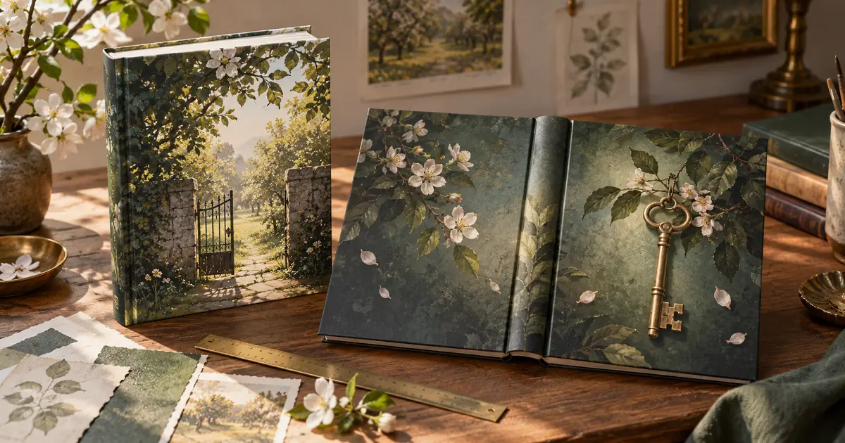

A good AI book cover needs to work twice: as a small image that helps a reader recognize the book, and as a production file that fits its destination. Approve the composition with the actual title first. Then prepare the ebook image or print wrap using the distributor's current requirements.
The useful shortcut is generating candidate artwork. The careful part is deciding what that artwork promises, keeping the words editable and checking the exported cover. A beautiful painting with nowhere to put a long title can be a worse starting point than a simpler illustration.
Write the cover decision before the prompt
Choose one reader, one genre and one reason this book belongs on that reader's shelf. Write a sentence someone outside the project could understand. For a fictional cozy mystery called The Orchard Key, the decision might be: “A welcoming rural mystery with a small unresolved secret, without suggesting horror.”
That sentence gives you a way to reject attractive mistakes. A blood-red sky contradicts the intended reading experience. A cheerful fruit catalog misses the mystery. A crowded scene with every character may explain the plot while making the cover difficult to recognize.
Collect a small set of current genre references to inspect hierarchy, contrast and type size. Describe those properties in your own words. Do not rebuild another book's distinctive composition. The point is to understand the shelf, then make a specific design for this manuscript.
Try the real title before polishing the art
Create a rough portrait rectangle in your layout editor. Add the exact title, author name and any necessary subtitle as editable text. A working design can be plain black type on gray. This is a space test, not the final typography.
Try two arrangements: a large title across the upper portion and a narrower title stacked beside the illustration. Include the longest line you will actually publish. If a series name is mandatory, include it now instead of discovering later that it competes with the title.
For The Orchard Key, a small brass key hanging from an orchard gate could leave quiet sky above. A close-up of many keys might look detailed but offer weak separation behind the words. Test both using the same temporary title size so the comparison means something.
Generate one clearly bounded art layer
Describe the image area and the space the layout needs. Keep the production measurements in the layout file; an image prompt is not a dependable way to set a spine width.
This is an original planning example, not a measured model test. Review what the image actually contains. A model may add lettering despite the instruction or turn the key into an impossible shape. Select on composition first, then repair a local defect if the overall design is worth keeping.
Save the prompt and selected result together. If the next revision changes the gate angle, say so explicitly. Rewriting the entire brief makes it harder to identify why the cover improved or became less useful.
Judge the cover as a reader will see it
Place your actual type over each candidate. Shrink the complete cover until it resembles a small shopping result. Can you read the title without enlarging it? Can you distinguish the main subject? Does the image still suggest the intended genre?
Then inspect a larger preview. Check the space around the author line, the balance between subtitle and title, and any art details that seem accidental. At full size, examine edges, repeated shapes and obvious image defects. These are different tests; passing one does not substitute for the others.
Keep a short rejection note for each candidate: “key disappears,” “title covers the only focal point,” or “mood suggests a thriller.” Those notes guide the next revision more effectively than “make it professional.” The album-cover thumbnail guide offers another way to think about small-format recognition, although a book needs its own typography and print plan.
Calculate usable pixels at the placed size
Changing a file's DPI label does not create image detail. What matters is how many pixels are available across the physical area where you place the image.
For example, an illustration placed at 6 inches wide needs 1,800 pixels across to supply 300 pixels per inch. At 9 inches tall, that same calculation gives 2,700 pixels. Those numbers describe a 6-by-9-inch area only. They do not include bleed, a spine or a back cover.
If you crop away a quarter of an image, calculate using the pixels that remain. If you enlarge an illustration with an upscaler, inspect the result for invented texture and edge artifacts. A larger file is useful only if it still looks acceptable at its intended size.
The KDP paperback cover requirements call for a single PDF containing the back, spine and front, with print-specific image and layout requirements. Treat those as destination rules, not a universal specification for every printer.
Build the wrap from the final book specification
Get the final trim size, binding, paper choice and page count before building the print wrap. A manuscript revision can change the required spine width. Do not stretch a finished front cover across a new wrap and hope the folds land correctly.
Use the KDP cover calculator and templates when publishing through KDP, or the equivalent template from your printer. Put the template on a guide layer. Keep your editable title, art and back-cover copy separate from that guide.
Review the front, spine and back as three connected surfaces. Give the back copy enough breathing room. Keep essential elements out of trim and barcode areas specified by the template. Remove guide artwork from the final export, while retaining it in the working file for later revisions.
Make two approvals, not one
Approve the content first: exact title, subtitle, author spelling, edition details and any endorsement wording. Then approve the file: correct dimensions, font handling, image quality, color preparation and destination format. A proofreader and a designer may catch different problems.
Download the cover handoff worksheet to record both approvals. Open the exported file independently of the editor. For print, inspect a physical proof before ordering a quantity when your printer offers that option. A glowing monitor cannot show exactly how dark artwork will look on a particular paper.
How QuestStudio helps
Use Image Lab to develop the illustration and compare a small number of compositions. Keep the approved title space in the prompt, and use a reference when the selected model supports the edit you need. Finish typography and print construction in a layout editor.
If the image itself contains unwanted lettering, the editable poster workflow explains why separating art from final words makes later changes easier. Do not restart the whole cover just because a subtitle changes.
Frequently asked questions
Can AI generate the entire print-ready cover?
It can generate a visual concept, but you still need to verify dimensions, typography, spine, bleed and the printer's export requirements. Treat a generated mockup as artwork until those checks are complete.
Should I ask the image model to write the title?
For production, editable type is easier to proofread and revise. Even correctly generated words may become difficult to change without altering the illustration behind them.
Does setting an image to 300 DPI fix low resolution?
No. Inspect actual pixel dimensions at the placed size. Metadata alone does not supply missing detail, and upscaling still needs visual review.
Can the same file serve an ebook and a paperback?
The same artwork can support both, but the deliverables differ. A paperback wrap includes surfaces and production allowances absent from a front-cover ebook image.
When should I stop generating variations?
Stop when one concept passes the genre, title-space and thumbnail tests. Use focused editing and layout work to finish that candidate instead of changing every decision again.
Finish the cover that survives the handoff
Choose the artwork with the real words in place, then build the destination file from verified specifications. The cover is ready when the reader-facing design and the production proof both work.
Compare two cover compositions in Image Lab
Hero image: AI-generated editorial illustration. Examples are original planning exercises, not measured model tests.