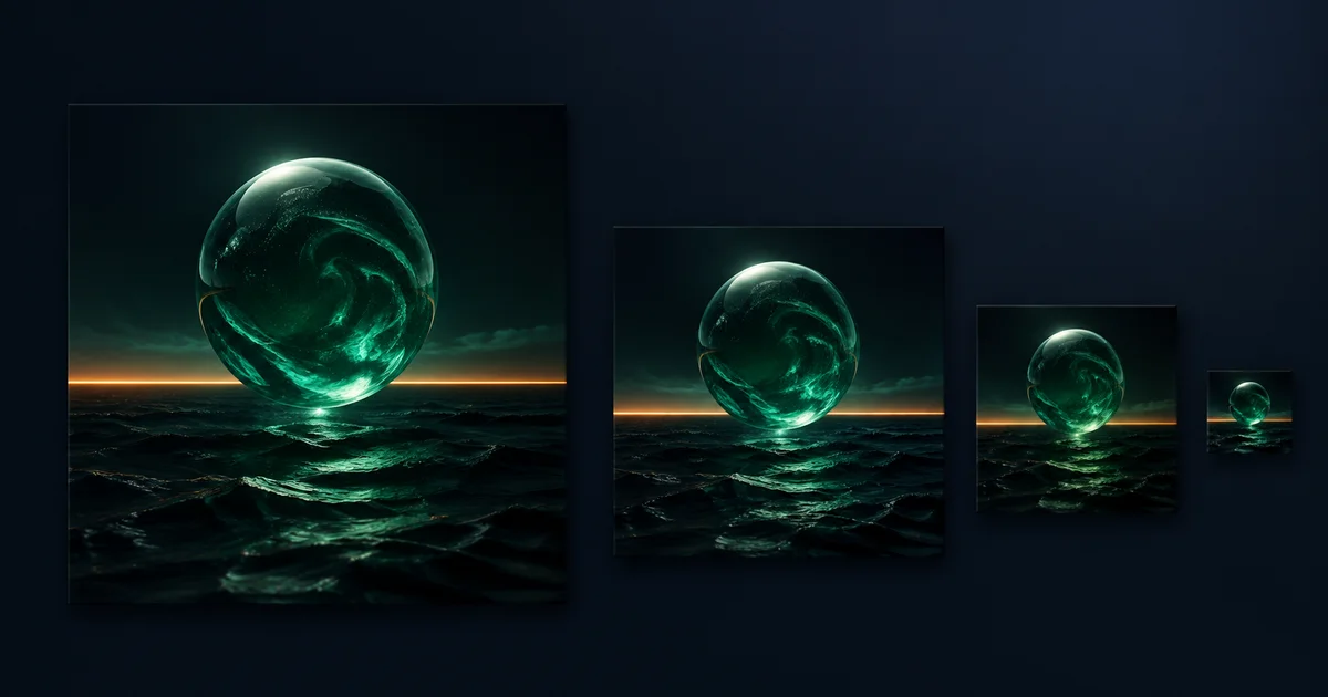

A strong AI album cover is not simply a beautiful square image. It is a release identifier that should feel connected to the music, remain recognizable beside dozens of other covers, leave controlled space for accurate typography, and survive being reduced to a tiny thumbnail.
The prompt should therefore behave like a design brief. Give the model one visual idea, one focal subject or symbol, one palette, one medium, and one composition. Generate the artwork without important text, test the image at three sizes, and add the artist name and release title afterward.
Quick answer
Describe the release in three emotional words, choose one original symbol, limit the palette to two dominant colors plus one accent, request a clean square composition with title space, and forbid logos or copied album styles. Approve the artwork at 64 pixels before upscaling or typesetting it.
Translate the music into a cover brief
Do not ask the image model to “listen” to a song unless the workflow explicitly accepts audio and explains how it uses that input. Instead, translate the release into observable decisions. Write down three mood words, the energy curve, one recurring lyric or theme, one image the listener should remember, and one thing the cover must avoid.
Emotional job
Examples: tense, nocturnal, defiant; warm, handmade, close; weightless, patient, luminous.
One visual anchor
Choose one face, object, silhouette, place, symbol, or geometric event—not a collage of the entire song.
Recognition cue
Decide what should remain visible at 64 pixels: a bright circle, split face, red doorway, or high-contrast horizon.
Originality boundary
Name your own references and materials. Exclude protected logos, existing cover layouts, and imitation of a named creator.
Genre can help, but it should not become a stereotype generator. “Dark electronic” is weaker than “one glass sphere over black water, emerald glow, thin amber horizon, large quiet sky.” The second direction can be seen, tested, and revised.
Use this complete AI album cover prompt
Replace the bracketed fields. Keep the visual artwork and typography as separate production stages.
The thumbnail instruction is not magic. It forces simpler choices, but you still have to test the output. If the cover only works because of tiny texture or several equal focal points, revise the composition before adding more detail.
Six original prompt variations
1. Nocturnal electronic single
2. Intimate acoustic EP
3. Restless alternative release
4. Late-night jazz project
5. Bright pop single
6. Ambient instrumental album
Run a three-size thumbnail test
| Review size | What to inspect | Reject when |
|---|---|---|
| Full working file | Edges, hands or faces, gradients, texture, artifacts, ownership, and room for type | Important details are malformed, copied, unlicensed, or impossible to repair locally |
| About 640 px | Subject hierarchy, title zone, palette, crop, and whether the visual matches the release brief | Several elements compete or the intended title placement covers the focal point |
| 64 px thumbnail | One memorable shape, light-dark separation, and immediate recognition without zooming | The subject disappears, the cover becomes gray noise, or the main idea depends on tiny detail |
Do not sharpen a weak composition into submission. If the 64-pixel version fails, enlarge the main subject, remove secondary objects, simplify the background, or increase tonal separation. Then repeat all three checks.
Add typography after the artwork passes
Even when an image model can spell, the release title is metadata, not decoration. Add it separately so the exact artist name and title can be checked against the distributor form. Keep a text-free master, an editable typography file, and the final flattened export.
At thumbnail size, one title line often works better than a complex lockup. Test the type over the actual artwork, not on a blank canvas. Confirm contrast, safe margins, letter spacing, and whether the title remains readable without obscuring the recognition cue. If the text is optional, compare a text-free version rather than assuming every cover needs a title.
Prepare a distributor-ready export
Requirements differ by distributor, so check the service you will actually use. DistroKid's current artwork guidance recommends a square 3000 by 3000 pixel JPG in RGB and accepts a minimum of 1000 by 1000 pixels. It also warns against URLs, QR codes, prices, service logos, unlicensed images, low-quality artwork, references to physical media, and reuse of the same artwork across releases.
TuneCore's guidance asks for a square file from 1600 by 1600 through 3000 by 3000 pixels, RGB color, and text limited to the artist name and release title exactly as submitted. Those ranges are not universal platform law; they are two current distributor requirements. Recheck the destination before delivery.
- Export one perfect square in the required file type and RGB color space.
- Use the same verified artist and release spelling in the artwork and metadata.
- Remove URLs, QR codes, prices, social or streaming logos, and unsupported claims.
- Inspect for blur, compression, AI artifacts, copied elements, and unlicensed references.
- Archive the prompt, source references, editable type file, approval version, and final export.
Fix the common failures
The cover feels generic. Replace the genre label with one original symbol and a specific material, geometry, and environment. “Dreamy pop” is broad; “one yellow ribbon spiral casting a crisp shadow on coral” is actionable.
The artwork becomes mud at thumbnail size. Remove secondary objects, enlarge the focal shape, and separate it from the background by brightness or hue. Do not solve hierarchy with more glow.
The title has nowhere to go. Return to the text-free generation and request negative space in one named zone while keeping the approved subject unchanged. Avoid squeezing type around every edge.
The image resembles an existing cover. Change the symbol, crop, palette, medium, and layout together. Use your own photographs or licensed references, and document what influenced the direction.
The upscaled version reveals artifacts. Repair edges, faces, repeated textures, and gradients before the final resize. Upscaling cannot turn a structurally wrong image into approved artwork.
Create the cover in QuestStudio
QuestStudio currently exposes Nano Banana Pro 4K in Image Lab for high-resolution image generation. Generate a square, text-free master, compare a small set of controlled variations, and keep the approved prompt beside the result. Export to your distributor's exact dimensions and file requirements in the final editing step.
Measure whether this guide leads to a first usable square, an approved second variation, repeat creation, newsletter subscription, and paid conversion. A pile of attractive drafts is activity. One release-ready cover with a documented source and approval trail is progress.
Frequently asked questions
What should an AI album cover prompt include?
Include the release mood, one dominant symbol or subject, a restrained palette, square composition, lighting or medium, deliberate title space, originality constraints, and a requirement that the design remains recognizable at thumbnail size.
Should I ask the image model to write the artist name and title?
Generate a clean title zone, then add the verified artist name and release title in a design tool. This keeps spelling, hierarchy, alignment, and metadata consistent and makes later corrections easier.
What size should album cover art be?
Requirements vary by distributor. DistroKid recommends a square 3000 by 3000 pixel JPG in RGB and accepts a minimum of 1000 by 1000 pixels. TuneCore asks for a square file from 1600 by 1600 through 3000 by 3000 pixels. Check your distributor before delivery.
How do I test whether album art works as a thumbnail?
View it at full size, around 640 pixels, and at 64 pixels. At the smallest size, the main subject, light-dark separation, and one memorable shape should still read without zooming.
Can I copy the visual style of a famous album or artist?
Build an original direction from mood, medium, palette, geometry, era-neutral production cues, and your own references instead. Do not copy protected artwork, logos, characters, or a named creator's signature treatment.
Approve the small cover before the large export
Write the release brief before the prompt. Generate one original symbol, test it at 64 pixels, and separate artwork from typography. For the next production step, use the AI image text-rendering workflow, the commercial-rights checklist, and the upscaling quality guide.
Open Nano Banana Pro 4K in Image Lab and start with the text-free master prompt.