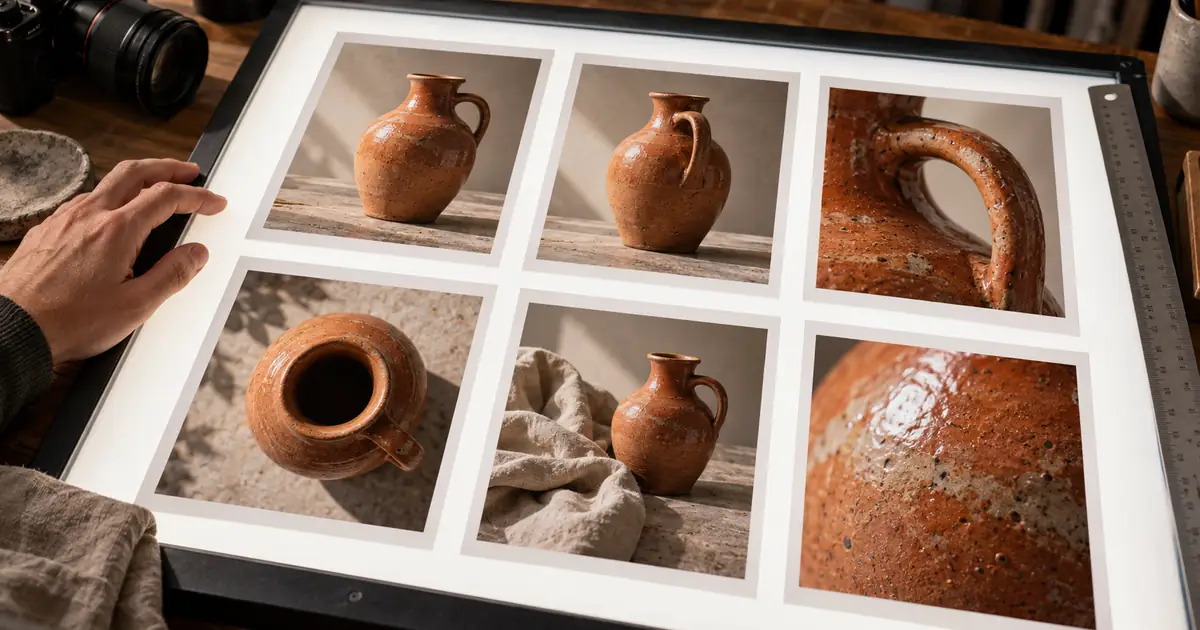

For a useful Photoshop grid, define the page, margins, gutters, and number of images before arranging the pictures. A six-image product contact sheet should help someone compare six assets at a glance. Guides help you align those assets, while the exported page contains the images and any labels you deliberately add.
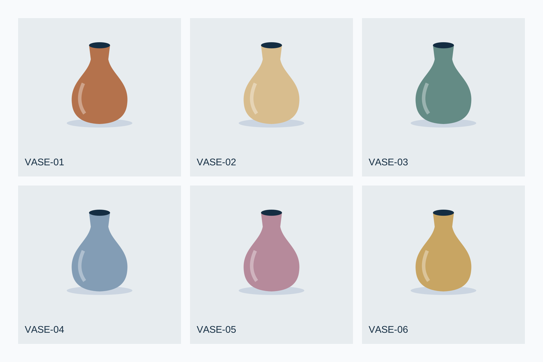
This tutorial uses a measured 1800 × 1200 pixel example with two rows and three columns. The downloadable sheet is an original SVG layout with illustrated vase samples, not a native Photoshop document. The Photoshop menu routes below were checked against Adobe's documentation on November 1, 2026; the sheet itself was rendered and inspected outside Photoshop.
Choose a contact sheet or a guide layout
Use a contact-sheet workflow when you already have a folder of pictures and need a consistent review page. Use guides when you want more control over placement, cropping, captions, or a composition that differs from a regular thumbnail sheet. Both can produce a grid, but they solve different parts of the job.
Adobe's Contact Sheet II documentation describes File → Automate → Contact Sheet II, with controls for the source folder, document settings, thumbnail rows and columns, spacing, rotation, and captions. It also explains the option to keep image and caption layers separate instead of flattening the result.
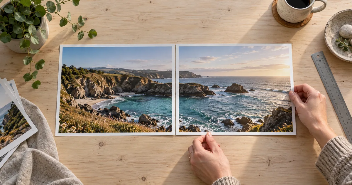
Choose the route based on the review you need. A buyer comparing product angles may want matching crops and clear IDs. A creative director comparing lighting treatments may want the whole source frame visible. Decide which comparison matters before forcing every asset into the same crop.
Calculate a six-image layout
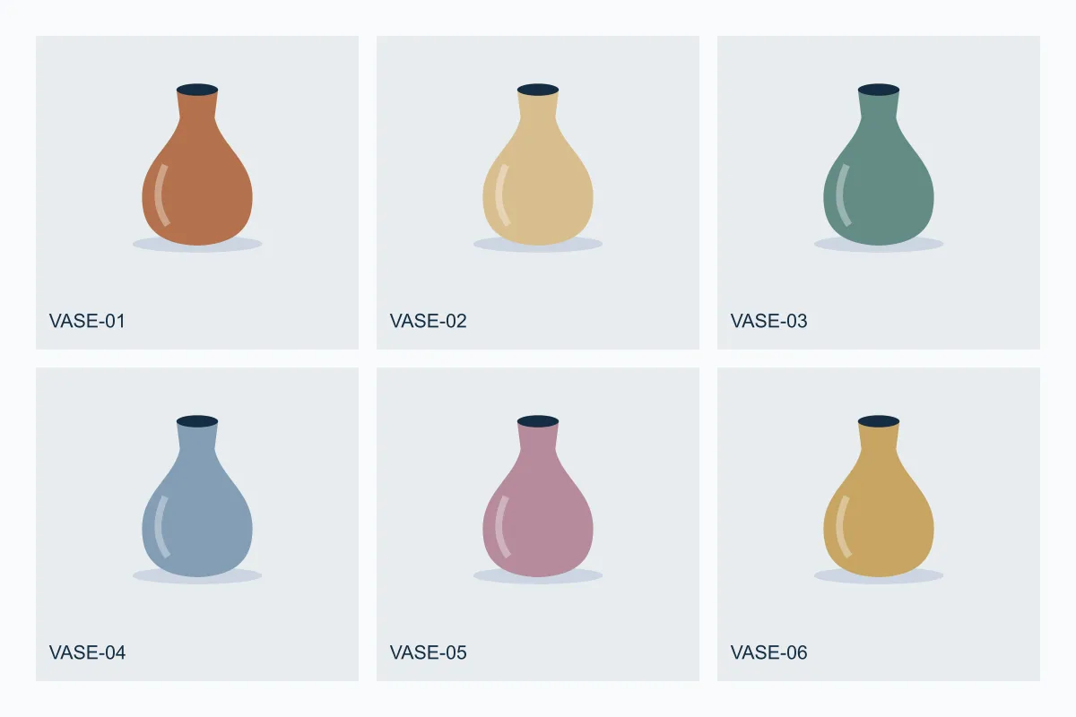
Our example has a 60-pixel outer margin and 30-pixel gaps between cells. The usable width is 1800 minus two margins and two gutters. Divide that remainder by three to get a 540-pixel cell width. The usable height is 1200 minus two margins and one gutter, divided by two, giving a 525-pixel cell height.
| Setting | Example value | Reason |
|---|---|---|
| Canvas | 1800 × 1200 px | Landscape review page |
| Outer margins | 60 px on all sides | Clear space around the sheet |
| Horizontal and vertical gutters | 30 px | Separate neighboring cells |
| Cell size | 540 × 525 px | Three columns and two rows |
| Cell left edges | 60, 630, 1200 px | Each step adds a cell and a gutter |
| Cell top edges | 60, 615 px | Second row follows the first gutter |
These are cell dimensions, not a requirement to stretch every photograph. Reserve space for a label within the cell if you need one, and fit the image into the remaining area. Stretching a bottle to fill an arbitrary rectangle can change the apparent packaging proportions and make the review misleading.
Build the automatic contact sheet
Prepare a folder containing only the six approved pictures. Give them stable IDs before opening the contact-sheet dialog. An ordered set such as VASE-01 through VASE-06 is easier to discuss than six almost identical filenames ending in “final.” Keep a separate record linking each ID to its full-resolution source.
In Photoshop, choose File → Automate → Contact Sheet II and select the source folder. Set the document dimensions, resolution, and color mode for your intended delivery. For a digital review, verify the resulting pixel dimensions. For a printed proof, choose the physical size and print resolution deliberately instead of assuming that a screen preview establishes print quality.
Set three columns and two rows. Choose the order in which images fill the sheet. Review automatic spacing or enter the manual spacing needed for your layout. Decide whether rotating images to fit is appropriate; a sideways package may fill a cell while making a product comparison harder.
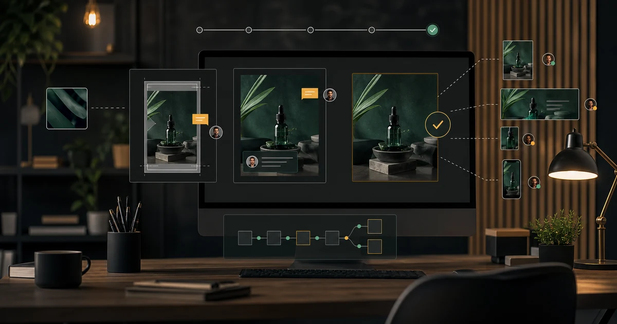
Enable filename captions only when the names are useful to the reviewer. Keep separate layers if you need to revise the images or labels afterward. Generate the sheet, then inspect each placement. Automation saves arrangement time, but it does not determine whether the correct six source files were selected.
Build a custom grid with guides
For a custom layout, create the document first and set the ruler units to match your calculations. Add guides at the margins and cell boundaries, including both sides of each gutter. Adobe's guide documentation describes the ruler and guide controls and notes that guides do not print.
That distinction matters. A guide is an alignment aid, not a border in the exported image. If the final sheet needs visible dividers, create actual line or shape layers. If the page only needs white gutters, leave those areas empty. Do not rely on guide visibility to communicate information that the recipient must see.
Place each photograph on its own layer or suitable editable object. Move it into the intended cell, preserve its proportions, and choose a deliberate crop. Keep the product itself consistent in apparent scale when scale is part of the comparison. If one image is a detail view, label that difference so it does not look like an accidental framing error.
Check crops, labels, and reading order
Review every cell at a useful zoom. Look for clipped handles, missing bottle caps, labels cut in half, and awkward slivers of background. A clean grid can hide these defects because its overall alignment looks polished. Inspect the content inside each rectangle as carefully as the spacing around it.
Use short, stable captions. “VASE-03 · handle detail” tells a reviewer more than “option three.” Keep the text readable at the size the sheet will actually be viewed. If the recipient must zoom excessively to identify the image IDs, deliver a larger proof or a simpler page.
Check reading order with someone who has not assembled the sheet, or review it after stepping away. State whether selections should be returned by image ID, row and column, or filename. One consistent method prevents feedback such as “use the one on the right” from becoming ambiguous after the page is resized.
Use the downloadable example correctly
The SVG is a reusable vector layout, not a PSD with Photoshop-specific editable layers. A vector editor can modify its shapes and labels. Opening an SVG through a raster import route may turn it into pixels, so preserve the original file and choose the dimensions deliberately. Do not mistake a rendered preview for a fully editable production master.
Replace the illustrated samples with your own approved photographs when building the real proof. The illustrations demonstrate spacing and identification; they are not photographic evidence of a real vase. Keep source images outside the sheet so a reviewer can inspect full detail before making a final production decision.
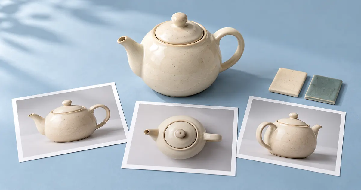
The image reference-pack workflow explains how to collect approved source views. Use Editor Lab for a supported focused image edit, or Image Lab when a missing supporting image needs to be created. Assemble and review the final contact sheet in the layout tool that fits your delivery.
Frequently asked questions
Do Photoshop guides appear in the exported image?
Guides are alignment aids and do not print. Add actual shape or line layers when the delivered sheet needs visible borders.
What dimensions does the example use?
The original layout is 1800 × 1200 pixels, with 60-pixel margins, 30-pixel gutters, three columns, and two rows.
Is the download a Photoshop PSD?
No. It is an original editable SVG layout with illustrated samples. Preserve it separately from any rasterized copy.
Should every photo fill its entire cell?
Only when the crop serves the review. Preserve product proportions and keep important details visible rather than stretching the image.
Was this contact sheet created inside Photoshop?
No. The example was rendered from an original SVG. The Photoshop steps are documented routes checked against Adobe's official guidance.
Prepare the images for your proof
Use the supported controls in Editor Lab for a focused source-image correction, then assemble and review the contact sheet in your layout tool.