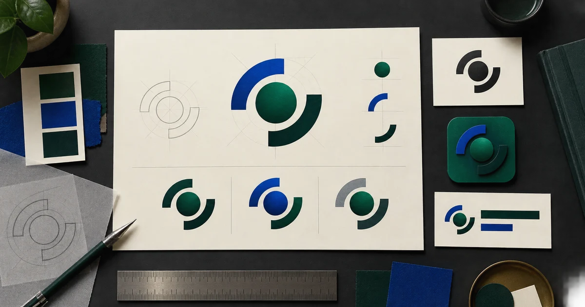

An AI logo generator from text is useful for exploring directions, not for declaring the first polished image a finished identity. A real logo must stay recognizable when tiny, work without color, pair cleanly with the exact company name, and remain editable across years of applications. It also needs an originality and trademark review that an attractive preview cannot provide.
The practical workflow is to define the brand decision, generate a simple symbol without text, compare controlled variations, test the strongest candidate, then reconstruct it as clean editable artwork. The result is not just an icon. It is a small, documented system your website, product, social profiles, print vendor, and collaborators can use consistently.
Quick answer
Write a six-line brand brief. Choose one logo type and one symbol territory. Generate the symbol with no lettering, compare three variations that change only one factor, and test the winner at favicon, profile, and large-display sizes. Search for confusing similarities, rebuild the chosen mark as editable vector artwork, typeset the wordmark separately, and export a documented logo kit.
Write the brand decision before the prompt
“Make a modern logo for my business” gives the model no meaningful constraint. Start with the choice the mark must help a customer make. A neighborhood bakery may need to feel warm and established; a privacy tool may need to signal control without using another shield; a children’s science program may need curiosity without looking childish.
Fill six lines: audience, offer, desired impression, reason to believe, places the logo appears, and ideas to avoid. Choose two or three specific traits, such as “precise, calm, resourceful.” Avoid vague stacks like “modern, premium, innovative, bold, friendly, timeless.” Traits are useful only when they rule something out.
Business job
Name what the company helps people do and what makes that offer credible.
Recognition cue
Pick one ownable idea, object relationship, motion, or structural metaphor to explore.
Real destinations
List the smallest and hardest uses: favicon, app icon, invoice, sign, package, or embroidery.
Exclusion list
Ban category clichés, competitor colors, initials you do not need, and symbols with the wrong meaning.
Choose the logo type before generating
A wordmark is the business name treated typographically. A symbol is a standalone graphic. A combination mark pairs both. A badge contains the elements inside a shared shape. Most new businesses benefit from exploring a simple symbol and a separate wordmark because each component can be assessed and revised without corrupting the other.
Decide which component must carry recognition. If the name is short and distinctive, typography may do most of the work. If the product needs a tiny app icon or avatar, a symbol matters more. If customers have never heard the name, do not expect an abstract icon to explain the entire offer. The website heading, tagline, photography, and copy carry context that the logo should not be forced to illustrate.
Prompt one original symbol, not a page of branding
Ask for a flat, front-facing mark on a plain background. Mockups on glass offices, embossed cards, and glowing signs can make weak geometry feel convincing. They hide the very questions you need to answer: is the silhouette clear, is the negative space intentional, and does the mark still work with one ink?
The exclusions matter. “Original” is a direction, not a guarantee, but removing letters, category clichés, existing brands, and presentation effects gives you a cleaner concept to evaluate. Save the exact prompt and generation settings beside every candidate you keep.
Use a controlled variation matrix
Do not compare ten unrelated logos. Generate three directions from the same brief and change one variable at a time. This turns preference into a decision you can explain. First vary the symbol construction while holding color and weight fixed. Then vary weight or negative space on the strongest construction. Explore color only after the mark works in black.
| Round | Keep fixed | Change | Decision |
|---|---|---|---|
| Structure | Brief, palette, weight | Shape relationship or silhouette | Which idea is easiest to recognize? |
| Refinement | Chosen structure, one color | Spacing, corner character, visual weight | Which version survives at small size? |
| Color | Approved geometry | One accessible primary palette | Which color supports the intended impression? |
| Lockup | Approved symbol and name | Symbol-to-wordmark scale and spacing | Which arrangement works across destinations? |
Score candidates on recognition, relevance, simplicity, distinctiveness, balance, and reproducibility. Hide the polished mockup and inspect the raw mark. If a direction only feels credible on a premium business card, it is not ready.
Keep the symbol and wordmark separate
Generated lettering may look plausible while misspelling the name, inventing glyphs, or making spacing impossible to edit. Generate the symbol alone. Then choose a properly licensed typeface and typeset the exact business name in a layout or vector editor. Adjust size, tracking, alignment, and the space between mark and name using real text or outlined final artwork—not pixels baked into an image.
This separation also makes the identity flexible. The symbol can become a favicon or profile image. The full lockup can appear on a website or proposal. The wordmark can be corrected if the legal name, descriptor, or typography changes without regenerating the symbol. For broader text-quality checks, use the AI image text-rendering workflow.
Run the three-size and one-color tests
Place the mark into the situations where it will fail fastest. At roughly favicon size, ask whether the silhouette remains identifiable without internal details turning to noise. In a circular social crop, confirm that important edges have breathing room. At large size, inspect awkward joins, accidental tangencies, uneven curves, and optical imbalance that a thumbnail concealed.
- 24-pixel test: reduce it until small details disappear; remove any detail that does not earn its space.
- Profile-crop test: place it inside a circle and square with generous safe area.
- Monochrome test: convert it to solid black, then reverse it to white on a dark field.
- Blur test: squint or blur the preview; the primary silhouette should remain different from nearby category marks.
- Production test: print it on an ordinary office printer and preview a one-color stamp or embroidery-sized version if those uses matter.
Color contrast still matters when the mark sits beside navigation, text, or a call to action. Keep a one-color version as the fallback rather than depending on a subtle gradient to hold the identity together.
Separate visual approval from trademark clearance
A concept can be attractive, generated from your own prompt, and still resemble an existing mark. Search the symbol with reverse-image tools, search the name and close variations, review competitors in related goods or services, and look for similar meanings and overall impressions. Document what you checked and when.
The USPTO federal trademark search guidance says a design element should be searched for possible conflicts and explains that a comprehensive clearance search involves multiple sources. Its likelihood-of-confusion guidance also notes that marks need not be identical; appearance, meaning, sound, commercial impression, and related goods or services can matter.
This workflow is not legal advice, and a database or image search is not a clearance opinion. Use qualified trademark counsel before investing materially in packaging, signage, an application, or a public launch. The AI commercial rights checklist can help you preserve source, terms, review, and approval records.
Rebuild the chosen mark as clean editable artwork
A generated raster image is not automatically a production vector. Redraw the approved geometry in a vector editor or hand it to a designer for reconstruction. Simplify anchor points, regularize curves where the idea calls for it, correct optical alignment, define exact colors, and inspect the outlines at high zoom. Do not rely on automatic tracing without cleaning the result.
Keep the editable source file, export an SVG for supported digital uses, and create PNG files at the exact sizes required by your destinations. Confirm the font license and either package the permitted font information or outline the final approved wordmark while retaining an editable source copy.
Assemble a logo kit people can use correctly
Package the primary lockup, horizontal lockup, standalone symbol, and monochrome versions. Include light-background and dark-background exports, an app or profile crop where needed, and both editable masters and practical web files. Use clear filenames with version and color mode rather than “final-final-2.”
Add one page of usage guidance: minimum size, clear space, approved colors, background rules, and examples of stretching, recoloring, rotating, outlining, or adding effects that should not happen. A modest logo kit with instructions prevents more damage than a folder of dozens of unexplained variations.
Explore the symbol direction in QuestStudio
Use Image Lab for the concept stage: one symbol, one background, no text, no mockup, and a short exclusion list. Keep your brief and prompt with the output, then perform the size, similarity, reconstruction, and kit steps outside the generator. If the brand needs a character instead of an abstract mark, the AI brand mascot guide covers a separate, expression-led workflow.
Open Nano Banana Pro 4K in Image Lab and generate one text-free symbol direction from your six-line brand brief.
Frequently asked questions
Can an AI logo generator make a finished logo from one prompt?
It can produce useful concepts, but a finished logo still needs selection, small-size testing, similarity review, clean reconstruction, wordmark typesetting, and export into a reusable kit. Treat the generated image as a direction, not automatic proof of originality or clearance.
What should I include in an AI logo prompt?
Describe the audience, brand traits, symbol territory, geometry, visual weight, color limit, background, and intended applications. Ask for one simple original symbol with no letters, readable text, famous logos, trademarks, mockups, or unrelated decoration.
Should I generate the company name inside the logo image?
Usually no. Generate and evaluate the symbol separately, then typeset the exact name with a properly licensed font. This keeps spelling, spacing, font licensing, alignment, and future edits under your control.
How do I know whether an AI logo is too similar to another mark?
Run image and trademark searches for the symbol, name, meaning, and overall commercial impression, but do not treat one search as clearance. Similarity review can be complex, so use qualified trademark counsel when the brand carries material business risk.
Which logo files should a small business keep?
Keep an editable vector master plus practical exports of the primary lockup, horizontal lockup, symbol, monochrome version, and light-background and dark-background versions. Include spacing, minimum-size, color, and misuse guidance.
After approving the illustration, turn a raster concept into an editable SVG handoff.