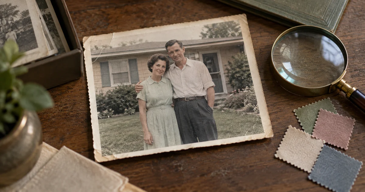

The colorized coat looks beautiful. It may also be completely wrong. A black-and-white photograph records tone, not a hidden color version waiting to be unlocked. The useful task is to make a careful interpretation, document the choices, and preserve the source beside it.
Download the photo color evidence sheet · Try a restrained color pass
Decide what the color version is for
A family-album viewing copy, a fictional poster inspired by an old photograph, and a documentary illustration have different standards. For an album, relatives may prefer a restrained interpretation that helps them see the scene. For a historical publication, readers need to know which colors are supported and which were chosen by an editor.
Write the purpose before opening a model. Our worked example is an invented family photograph of two adults outside a house. A relative remembers a green dress, a surviving paint sample suggests cream siding, and nothing establishes the color of the garden flowers. Those three facts should not receive the same confidence label.
If the monochrome image is itself the artwork you want to present, keeping it monochrome is a valid final choice. Colorization is an optional version. It does not replace preservation, accurate identification, or a good tonal restoration.
Prepare a source that does not need reinventing
Use the clearest scan or digital original available. Avoid beginning with a screenshot containing glare, a tilted border, or an aggressive phone filter. Keep the full untouched file, then make a working copy with sensible orientation and a neutral tonal range. Follow the photo restoration guide if the source has tears, stains, or missing areas.
Repair a crease across a plain wall separately from a crease across an eye. A color pass should not also be asked to reconstruct a missing face, change the pose, remove people, and upscale the image dramatically. When several changes arrive at once, you cannot tell whether a pleasing result still represents the same photograph.
Save a repaired monochrome intermediate. That gives you a stable reference for judging color alone. Do not repeatedly feed a colorized output back into a model simply because the previous version looked smoother.
Build a palette evidence sheet
List the large regions and the best evidence for each. A surviving garment, a dated color photograph of the same building, or a family recollection can guide a choice. A recollection is still a recollection; record who supplied it and avoid converting uncertainty into a precise color code.
| Region in the example | Evidence | Working decision |
|---|---|---|
| Dress | Family recollection: muted green | Try a subdued green; keep the recollection in the notes |
| House siding | Paint sample associated with the house | Use a cream family, then check under the photo’s lighting |
| Garden flowers | No color evidence | Keep restrained and label as an editorial choice |
| Shadows and highlights | Visible tonal structure in the source | Preserve the existing light direction and contrast |
A color reference photographed under warm light is not a laboratory measurement. The point of the sheet is to make choices reviewable. It also prevents a later edit from quietly turning a remembered green dress into a fashionable blue one.
Choose a colorization route
A dedicated colorization filter is useful when you want a color proposal without broad scene changes. An instruction-based image editor can take a detailed brief, but may also alter texture, features, or small objects. Pick the route according to what you can inspect and correct afterward.
Adobe’s Colorize documentation describes automatic color assignment, optional color pins, and output choices including a new layer. It also notes that the image should be in RGB rather than Grayscale. Interface labels may differ by Photoshop version. These controls are an example of an external editing route, not a claim that every AI editor exposes them.
Whichever route you choose, keep a reversible result. A new layer or separate output file lets you compare without losing the source. Start with moderate saturation and one overall interpretation before spending time on small corrections.
Write a brief that limits the task to color
This original instruction suits an image-editing model that accepts the source scan. Replace the example colors with your own evidence. Do not add “100% accurate” or a numeric identity score; words in a prompt do not create a measured guarantee.
For a first test, include only colors you can explain. If the house color is unknown, omit the cream instruction. Compare the result before asking for a richer palette. The goal is a version you can defend as a considered interpretation, not the most saturated image in the set.
Review shape before judging the palette
Place the repaired monochrome source beside the color result at the same size. Check eye spacing, mouth corners, hairlines, buttons, seams, window frames, and the outline of hands. If an image editor changed those structures, the problem is larger than a wrong color.
Temporarily view a grayscale version of the color output as a rough comparison. Large differences can reveal altered shading or reconstructed features, although different grayscale conversions can themselves change tone. Use that view as a screening aid, then inspect the original pixels and shapes directly.
Ask someone familiar with the person to review the face when possible. “This looks realistic” and “this still looks like my relative” are different judgments. Reject an attractive result that quietly changes the expression you meant to preserve.
Fix color bleeding at material boundaries
Common failures include a green collar tinting the neck, brown hair spilling onto the forehead, or a blue sky leaking into a hat. Inspect narrow boundaries at normal size and at a closer view. Edges around glasses, lace, fingers, and fine hair deserve particular attention.
If your editor supports masks or local color adjustments, correct the affected region while retaining texture and luminance. If it only supports broad regeneration, compare one narrowly worded revision against the accepted version. Stop if repairing a collar repeatedly changes the face.
Skin should not be one flat peach fill. The original light, shadow, and local variation still matter. Avoid painting every shadow blue or every cheek pink to make the image feel colorful. Lower saturation can be a better repair than adding another competing hue.
Handle uncertain objects without false precision
Uniforms, flags, team clothing, painted vehicles, and insignia can carry meaning. A wrong color may change what the viewer believes about the person or event. Use specific references when those details matter, or keep the monochrome version in the publication.
For uncertain regions, create two restrained palette options and label them A and B in your project notes. Ask which is better supported, not merely which looks nicer. If neither has evidence, retain the uncertainty in the caption. A short note such as “Colorized interpretation; clothing colors partly based on family recollection” is more informative than presenting a reconstruction as an original color photograph.
Deliver a useful pair of files
Export the color interpretation and its monochrome source at matching dimensions. Keep a larger working master and a separate sharing copy. If you print, review a small proof before ordering a full set; screen brightness and paper can change the apparent palette.
- The original scan is preserved and clearly named.
- Known colors and editorial choices are recorded separately.
- Faces, clothing details, and object geometry match the source.
- Color does not spill across important boundaries.
- The sharing caption identifies the image as colorized.
Store the evidence sheet with the files. A family member revisiting the project later should be able to understand why the dress is green and which parts remain unknown.
How QuestStudio helps
Use Image Lab with an available reference-image editing workflow to try one restrained interpretation. Upload the source, adapt the brief, and compare the output against your palette sheet. Detailed masks, archival file management, and print proofing belong in the external tools you use for those jobs.
The hero is a fictional AI-generated editorial illustration, not a real family archive or a restoration test. This guide’s example and worksheet were prepared September 24, 2026. Successful colorization here means a reviewable viewing copy with preserved structure, not recovered historical color information.
Frequently asked questions
Can AI recover the original colors of a black-and-white photo?
It can predict plausible colors, but the monochrome image alone does not establish the original palette. References and records can guide specific choices.
Should I repair scratches before adding color?
Usually repair distracting damage on a separate copy first. Keep the repaired monochrome version so you can judge the color pass independently.
Why did the face change when I colorized it?
A generative editor may reconstruct more than color. Compare facial structure with the source and use a more constrained filter or local editing if needed.
How do I correct a wrong clothing color?
Use a local mask, color pin, or selective adjustment where supported. Keep the material texture and inspect nearby skin and edges afterward.
Should I keep the black-and-white original?
Yes. Keep it untouched, save the interpretation separately, and identify the colorized version when sharing.