
To invert colors in Photoshop, select Layer → New Adjustment Layer → Invert or choose Invert in the Adjustments panel. The adjustment reverses color values in the layers it affects. Toggle its visibility to compare with the original, then use its layer mask or a clipping mask if the effect should reach only part of the image.
For a quick one-layer edit, Photoshop also has a direct Invert command. Use the adjustment layer when you expect to change the scope, approve a comparison, or return to the original after saving. The original layer stays available for a new proof.
Make the full negative first
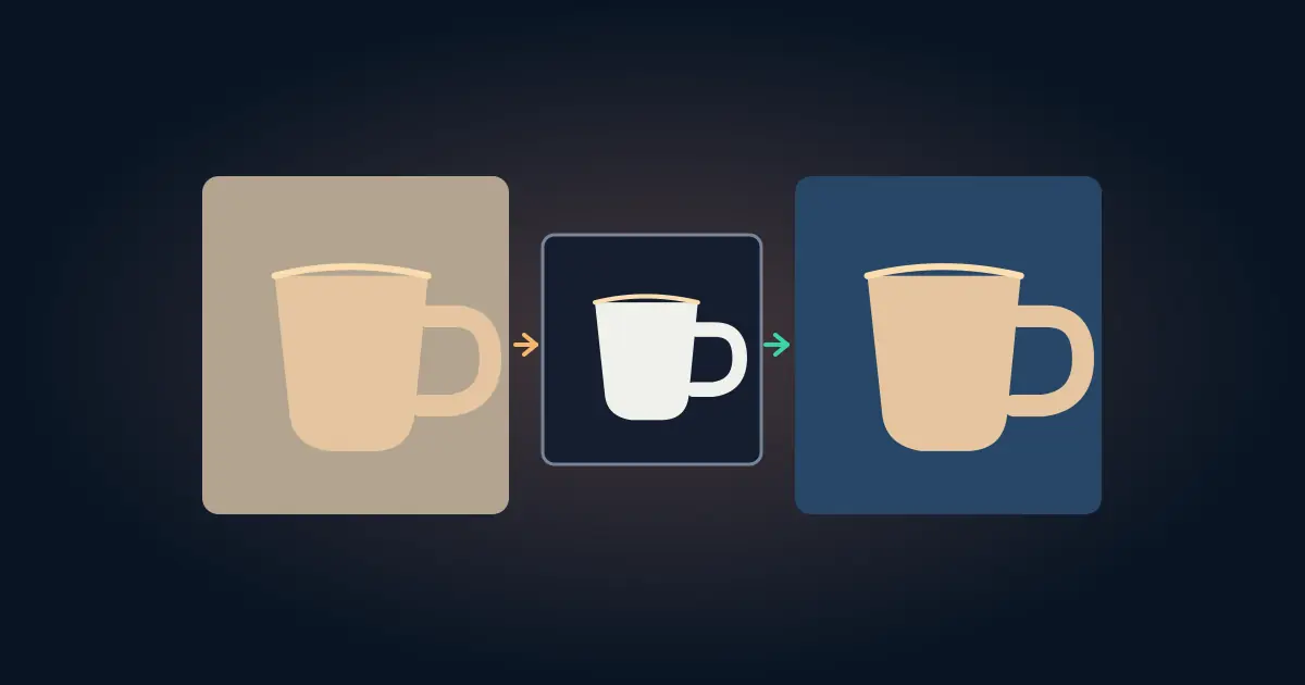
Open the document and add an Invert adjustment layer above the artwork. Compare the result with the layer turned off. A bright region becomes dark, and colors move toward their complements. In an ordinary 8-bit RGB example, each channel is reversed against 255. A sample RGB triplet of 20, 80, 200 becomes 235, 175, 55. Use a simple swatch like that to see what the effect does before you decide whether it fits a photograph.
Adobe describes Invert in its special color effects instructions. Color inversion differs from turning a photo black and white, flipping its geometry, or changing one background color. If you want a mirror of the image, use the Photoshop flip workflow instead.
Look for what becomes hard to read. An invert effect can make an image feel different while also changing a branded logo, the outline of a subject, or the color contrast of a title. Keep a plain copy of the original beside your experimental proof.
Limit the adjustment to the artwork
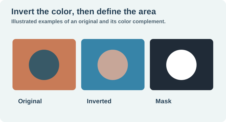
Imagine a poster with three layers: a photograph, a heading, and a small workshop badge. You want the photograph to look like a negative while the heading and badge stay readable. Place the adjustment just above the artwork you want to change. If other layers underneath also change, clip the adjustment to the intended layer or use a mask to define the affected area.
On the adjustment's mask, white reveals the inversion and black hides it. Paint on the mask thumbnail to protect the heading or the edge of a badge. Look at the boundary at 100 percent. A partially revealed edge can leave a line between the inverted and original colors. Use a clean selection or a deliberate transition where the design needs it.
When the heading is already a separate layer, placing it above the adjustment may be simpler than painting around the letters. The layered Photoshop graphic guide helps when deciding which pieces should remain independently editable. Test the scope by toggling the adjustment and watching which layers change.
Know what Photoshop is inverting
If the artwork looks unchanged while the selected area switches, inspect the active thumbnail. Applying an invert command to a mask reverses what the mask shows and hides. Applying the color effect to image pixels changes their colors. Both can be useful, but the resulting proof is different.
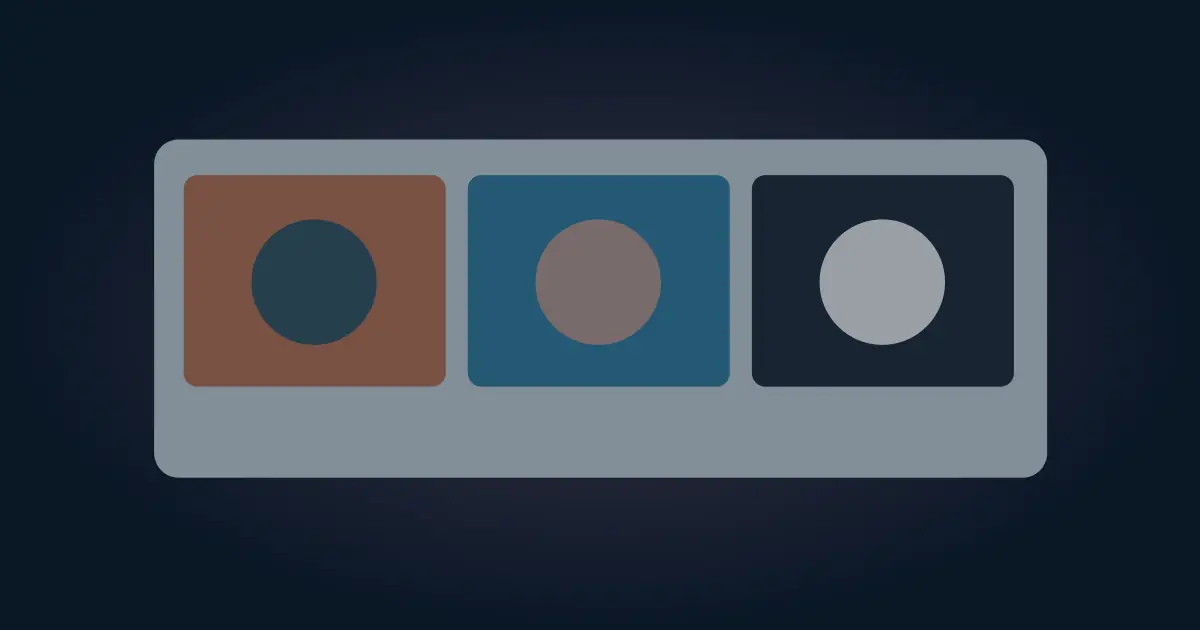
For a selective edit, make a small test on a duplicate. Pick one corner that should change and another that should stay original. If both change, check whether the mask is white across the whole layer or whether the adjustment is above more layers than intended. If neither changes, check the adjustment visibility, mask, and layer order.
If the task is simply to replace a solid background, create a separate fill instead. The background color workflow walks through protecting the subject and checking its edges against two backdrops. Invert is useful when the negative effect itself serves the design.
Compare the exported proof at its final size
Export a copy and reopen it outside Photoshop. Verify the heading, the edge of the adjustment, and the darkest detail in the image. A fine edge that looks clean zoomed in can turn into a visible halo at thumbnail size. If you plan to put text on the inverted artwork, test that text with the actual result and the intended export size.
Save an editable Photoshop master with the original artwork, the adjustment, and its mask. Name the layer for its scope, such as “Invert illustration.” If the recipient requests the original colors, switch the adjustment off and export another proof without rebuilding the artwork. Keep the two proofs named for their actual treatment.
Diagnose a bright edge around the subject
Suppose an orange symbol becomes blue after inversion but a thin orange rim remains around it. Zoom in and toggle the adjustment layer. If the rim stays orange only where the mask fades, inspect the mask boundary and compare it against the original outline. If other layers change as soon as you toggle, check that the adjustment is clipped to the layer you intended to affect and sits directly above it. A clean edge at high zoom is only part of the proof. Zoom out to the exported size and make sure the inverted symbol still reads against the background. If the design brief specifies an exact blue, compare it to the approved swatch and choose a direct recolor when the complementary result falls outside it.
How QuestStudio helps
Use Image Lab when you need a separate image idea or texture to test under the same title. Keep the exact negative effect in the Photoshop file where you can adjust and verify its scope. The worksheet gives you a small record of what changed and what the design needs to preserve.
Download the photoshop negative effect proof.
Frequently asked questions
Where is the Invert adjustment layer?
Choose Layer → New Adjustment Layer → Invert or use the Invert option in the Adjustments panel.
How can I invert just part of a photo?
Use the adjustment's mask or clip the adjustment to the layer you intend to change.
What happens when I invert a mask?
The mask reverses where it shows and hides its effect. That is separate from inverting image colors.
Can I return to the original later?
Keep the original layers and toggle or remove the Invert adjustment.
What should I check before exporting?
Check the adjustment boundary, readable lettering, and the result at the size people will see.