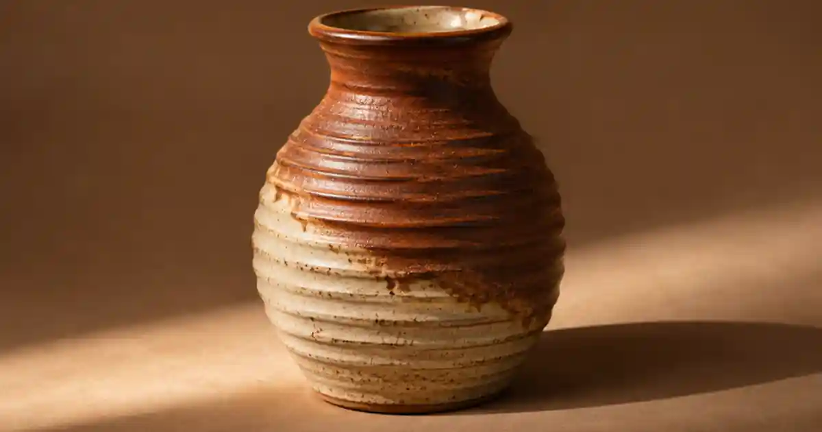

If a hand-thrown vase looks smooth in the product photo even though its ridges are a selling point, I recommend moving one light low across the surface. The shallow light can reveal small ridges through highlights and shadows. I keep one neutral reference photo and use the texture shot to show the detail a buyer should expect.
My gear pick for this setup
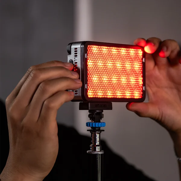
amaran Ace 25c, charcoal
A compact light to position low beside a small product
I’d consider the Ace 25c for close detail work when I need a movable light. Use a suitable stand and diffusion where needed. The placement does the texture work.
Choose the detail the customer should see
Pick a small area where the material makes a difference. On a ceramic cup it could be a throwing line, a matte glaze or the transition from glazed body to unglazed base. Set the camera and take a reference with broad soft light. Use that frame to compare color, shape and the appearance of the main label. If the texture is already clear at listing size, reserve the more dramatic lighting for a close detail rather than repeating the main image.
Lock the camera position and exposure for the first comparison where your setup allows it. Pick a crop where the important texture crosses the frame rather than hiding behind the silhouette. I use a fixed background and a small mark for the product position. Moving the camera and the light together makes it hard to tell what revealed the detail.
Move the light across the surface
Start with the source off to one side and move it lower so the light travels across the ridges rather than toward the camera along its axis. Watch how shadows change on the surface. Light crossing the grooves often reveals more texture than light running along them. Adjust in small steps. A larger or diffused source can soften a harsh highlight, while a smaller controlled source may give fine ridges a clearer shadow. The product shape and finish determine which result looks faithful.
For a glossy glaze, move the light while watching reflected bright areas. A strong strip can cover the very detail you are trying to show. Shift its angle or use diffusion while preserving the shallow direction. I keep the first frame where the texture appears clearly and the finish still looks like the real object. If a shadow hides the logo, add a modest bounce or photograph that angle separately.
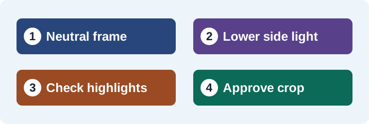
Make one neutral frame and two texture frames
Photograph the cup straight on under soft light. Keep the camera locked and try a shallow side light from the left. Take a third frame with the source slightly higher or more diffuse. Compare the same crop from each. The useful difference should appear in the surface, not as a change to the camera angle or white balance. If the lowest light produces dark areas that feel exaggerated, favor the middle option for the detail photo.
Check the full image at the size used on the listing. Then inspect the surface at a larger crop to see whether the detail survives export. I compare the label separately because a texture hero can make lettering hard to read. For an instructional close-up, add a caption that says what the viewer is seeing. For a catalog image, keep the neutral frame available beside the close detail so the buyer can compare both views.
Use the texture problem to choose the adjustment
| What you see | What I try |
|---|---|
| Ridges vanish under front light | Move the source low and across the grooves. |
| Highlights cover the finish | Shift the source angle or add diffusion. |
| One edge disappears | Adjust the bounce or make a separate shape shot. |
| Texture looks more severe than it is | Raise or soften the key and compare the real product. |
The ceramics product photo guide covers the overall shot set. The black-card workflow helps when the outline needs a darker edge. I keep the lighting that serves the specific detail, then record its position for future variants.
Preserve the surface through the edit
When I try a background variation in Image Lab, I compare the new frame with the physical detail shot. Check the direction and spacing of the grooves, any label and the glaze color. Use the original close-up where the texture is part of the buying decision. A different background can help the product stand out while the retained reference shows what the material actually looks like.
Look at the crop you will actually publish
Compare the side-lit and neutral frames at the size of a storefront thumbnail. If the texture disappears after resizing, try a detail crop or a second listing frame that gives the surface more of the image. If the thumbnail makes shallow marks look like damage, ease the shadow with a small white bounce card. Keep the same crop while comparing so the change you are judging comes from the light.
Make a three-frame proof for a listing detail
Suppose the side of a hand-thrown cup has fine ridges that look flat in the main image. I’d first take a broad-light reference that shows the entire cup and its real color. Next I’d position a low light across the ridges and keep the camera fixed. In the third frame, raise or soften the light just enough to retain the dark glaze detail. Compare the same area at listing size and in a larger crop. If the second frame creates a highlight that looks like damage, use the third. Save the first frame as the neutral reference and the accepted texture shot as a separate detail. Record the light height, side and approximate distance so the same effect can be repeated on the next product.
Download the product lighting worksheet (CSV)
Frequently asked questions
What does raking light do in a product photo?
It travels at a shallow angle across a surface. Small features can cast shadows or catch light, making texture easier to see.
Do I need a hard light for texture?
The light direction matters first. Compare a small light with diffusion when a hard highlight obscures the surface.
Why do glossy areas look worse under low light?
A bright reflection can cover detail at the current camera angle. Move or diffuse the source and compare from the camera position.
Should the raking-light shot be my main listing image?
Use it as the main photo only if it represents the product clearly. A neutral main image and a separate detail often work well together.
Sources and further reading
Affiliate disclosure
As an Amazon Associate I earn from qualifying purchases.
Continue with a useful next step
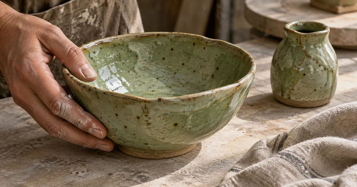 Image
Handmade Ceramics Photography: Glaze, Shape and Scale
Photograph handmade ceramics with accurate glaze, shape and scale. Plan real views, control reflections and review AI supporting scenes against the piece.
 Image
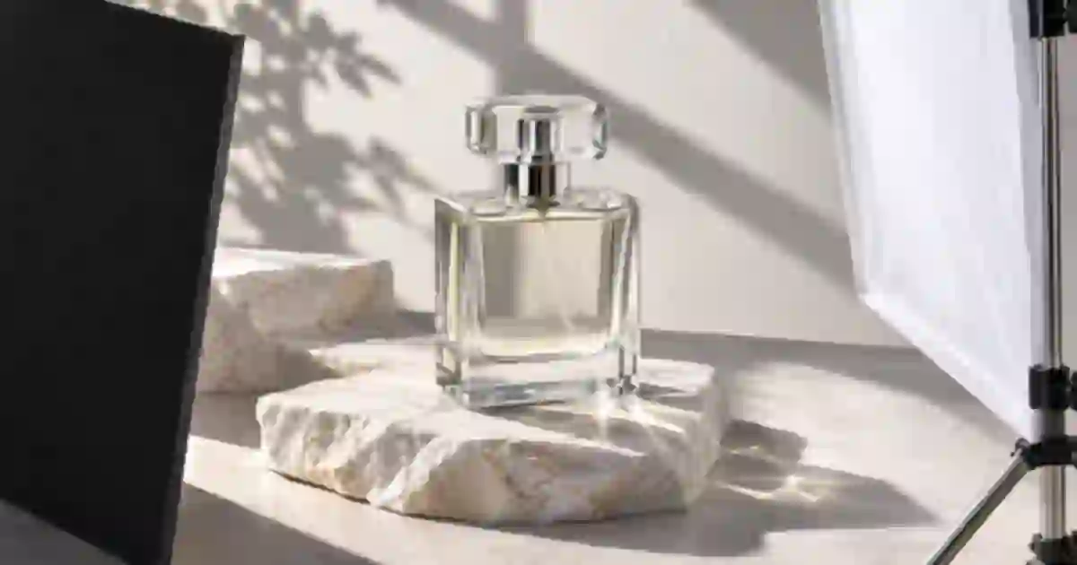
Negative Fill for Product Photography With Black Cards
Use negative fill to make clear or glossy products readable. Place a black card, compare four lighting frames and keep the product label easy to read.
 Image
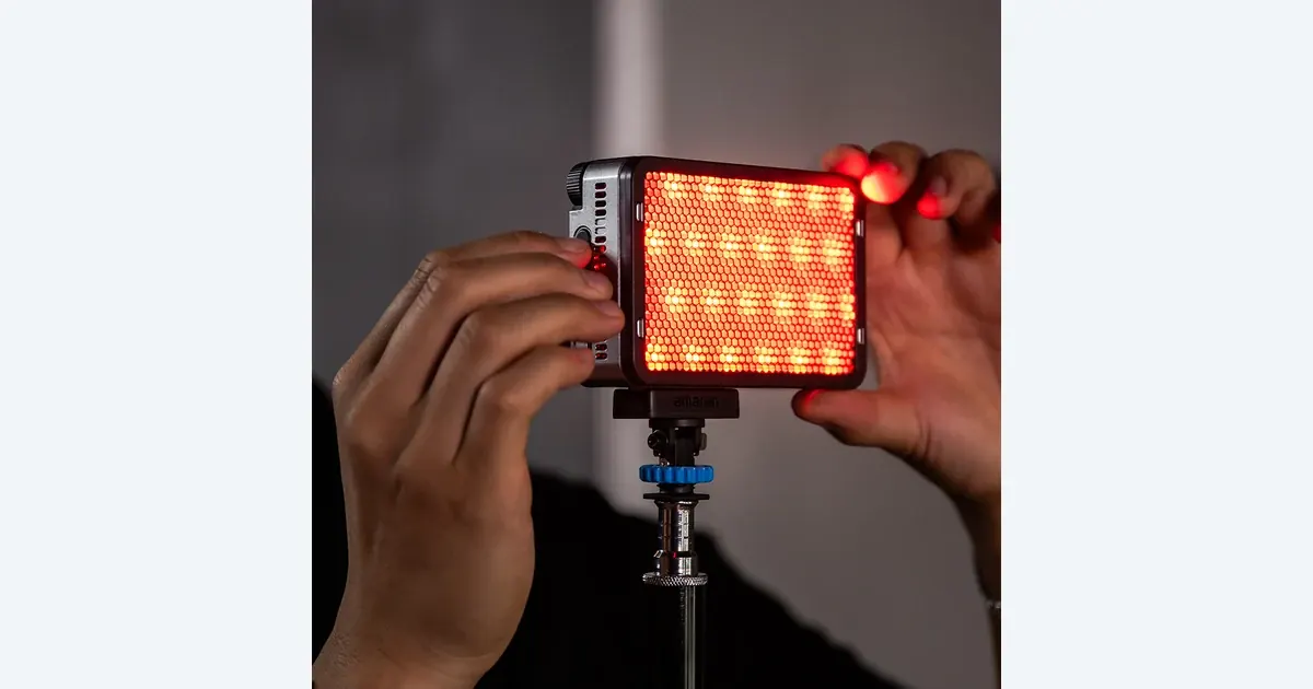
Portable LED Lights for Product Video: Ace 25c Guide
Choose a portable LED light for product videos. Review amaran Ace 25c power modes, reflections, fan noise and kit contents with a practical three-shot exercise.