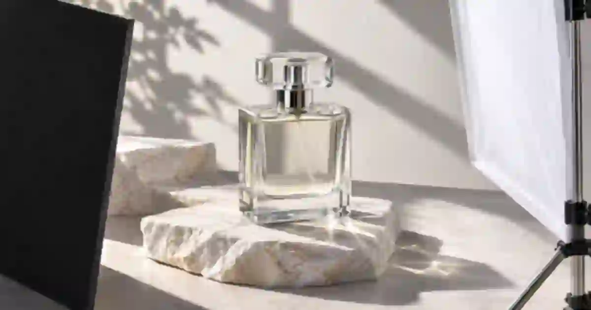

When a glass bottle disappears against a pale background, I recommend bringing in one black card and checking the edge before adding another light. Negative fill uses a dark surface to reduce bounced light or to create a darker reflection in a glossy surface. Used carefully, it can give a clear bottle or polished jar enough shape to read at listing size.
My gear pick for this setup
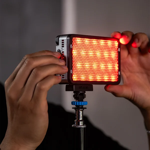
amaran Ace 25c, charcoal
A small key light for a tabletop flag test
I’d consider the Ace 25c for a small product that needs a controllable key. The pictured listing is the light. Use a separate black card and a suitable diffuser to build the setup shown below.
Look for the edge you need to recover
Set up one soft light or a diffused window and make a baseline frame. Leave the camera and product fixed. Look at the outline, shoulder, base and label at the size the shopper will see. If the left edge vanishes into the white sweep, aim to recover that side first. When both sides are indistinct, I still start with one card because I want to see which change each surface makes. A second light can make the label brighter while leaving the outline just as hard to read.
Place matte black foam board outside the crop on the side you want to shape. Bring it in gradually while watching the live view or making comparison frames. On glass, the edge often changes as the camera sees a darker reflected area. On a matte product, the card can reduce stray bounce and make the side fall darker. The distinction matters when the dark edge looks like a hard stripe. Change card angle or position and observe whether the stripe moves along the surface.
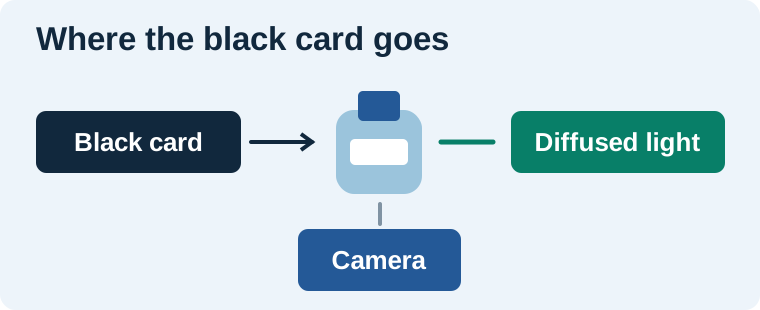
Make a four-frame comparison
- Take a baseline frame with the light and sweep in place.
- Add the black card on the problem side, just beyond the crop.
- Move the card closer or angle it until the edge is legible.
- Hold the useful card position and add a small white bounce on the opposite side if the front label became too dark.
Keep focus, exposure and white balance fixed if your camera or phone workflow allows it. That way the sequence shows what changed when the board moved. Review the small thumbnail and a close crop of the label. I choose the first frame where I can see the bottle’s shape and still read the approved text. A dramatic dark stripe might be attractive in a campaign frame and inappropriate for a primary listing photo.
Adjust shape without hiding the material
| What you see | One change to try |
|---|---|
| Clear bottle blends into the sweep | Bring a dark card near one side and check the edge. |
| Dark stripe overwhelms the shoulder | Move the card away or rotate it to narrow the reflection. |
| Label is dim but shape looks right | Try a small white bounce angled toward the front. |
| Card appears as an object in the frame | Move it outside the crop or adjust its angle while keeping the reflection. |
Chrome, coated plastic, clear glass and matte ceramic react differently. If the product is already dark, a black card can swallow the outline. I would move it back, use a lighter surface or keep a bright edge where the shape needs separation. For a second type of reflection control, see the circular polarizer guide for product photos. The card is a useful first adjustment when the reflection itself carries the product’s shape. The light box and softbox comparison can help if your starting lighting setup limits where you can place flags.
Make notes you can repeat
Draw the camera, light and board positions in the worksheet. Add the approximate distance from the card to the bottle, note which edge it shaped, and record which frame you approved. Take a behind-the-scenes photo from above if the setup will be reused. I mark the successful card location on the table with a small piece of tape. That gives the next person a way to rebuild the setup when the background or product changes.
Keep the approved bottle as the reference
Once the physical photo reads clearly, I keep it beside any background variation in Image Lab. When trying a new background, check that the bottle silhouette, reflection behavior, label and liquid color still agree with the approved shot. If a generated scene adds an unrelated stripe or removes the lip of the bottle, the reference makes the difference easy to see. I use the edited scene as a supporting asset when it preserves the product details the customer needs.
I also check the board in the brightest part of the reflection. Shiny tape or a bent corner can introduce a new highlight. If a clean edge suddenly becomes uneven, try a fresh flat board before changing the light. When you need two matching listing views, keep the board in the same relationship to the camera for each angle.
Plan a controlled bottle comparison
Use a clear bottle with a light label and a bright sweep. Save the no-card frame and name it A. For B, place the card to the left of the bottle and capture the same angle. For C, move the card in slightly. On D, keep the selected position and add a white bounce for the label. In the worksheet, score the edge and label separately. If C gives the strongest silhouette but the text becomes hard to read, compare B and D at listing size. I would choose the earliest change that makes the product clear and record its position for the next shot.
Download the product photography lighting worksheet (CSV)
Frequently asked questions
What is negative fill in product photography?
A dark surface reduces stray bounce or introduces a darker reflected shape. You can use it to reveal an edge or give a light product more depth.
Where should I put the black card?
Begin just outside the crop on the side you want to define. Move or rotate it while watching the outline and the reflection from your camera position.
Can I use black fabric instead of foam board?
A matte dark surface can work if you can hold it in place. Foam board is easy to angle and keeps a consistent shape from frame to frame.
What if the card makes the label too dark?
Move the card back, rotate it, or keep it in place and try a small white bounce aimed at the label. Compare the result at the intended crop size.
Sources and further reading
Affiliate disclosure
As an Amazon Associate I earn from qualifying purchases.
Continue with a useful next step
 Image
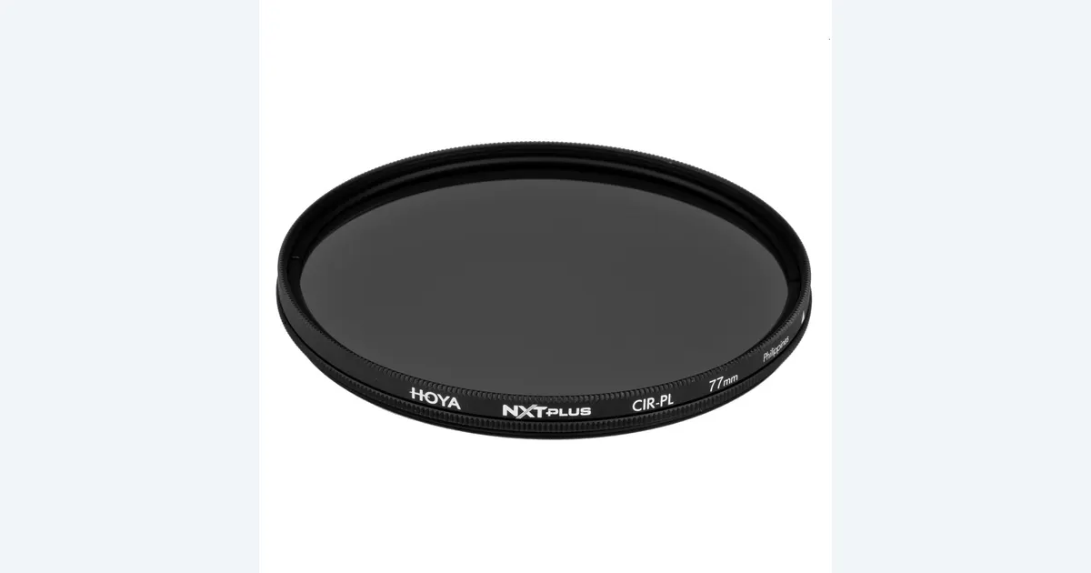
Circular Polarizers for Product Photos: Control Glare
Learn when a circular polarizer helps product photos. Check reflections, lens thread size and light loss, then compare Hoya NXT Plus with a no-filter setup.
 Image
AI Transparent Product Photography: Keep Glass Believable
Plan AI transparent product photography with real glass references, controlled backgrounds, and checks for rims, refraction, liquid levels, labels, and shadows.
 Image
Light Box vs Softbox for Product Photography
Choose a photo light box or a softbox setup for product images. Compare space, reflections, included equipment and video use before buying lighting gear.