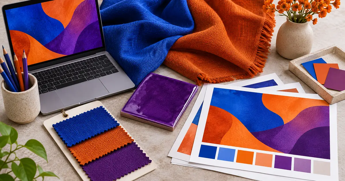

Two fabric colorways look distinct in the editing master but nearly identical in a printed insert. Increasing saturation may make the screen more exciting without helping the print. The problem can be the destination's available color range, rather than a weak photograph.
An out-of-gamut color is outside the range that a particular color space or output condition can represent. The destination matters. I would identify that destination and protect the differences customers need to see before making a broad color adjustment.
Ask “outside which gamut?”
A warning has meaning only relative to a specified target. A color may fit one display space but not a particular printer-and-paper combination. Changing paper, ink, profile, or delivery space can change the result. “Out of gamut” is not a permanent label attached to the object itself.
Adobe's gamut-warning guidance describes checking colors with a proof profile. Start by confirming that the profile represents the output you are actually preparing, rather than selecting a familiar preset without a reason.
Also distinguish gamut from bit depth. A higher-precision file can represent finer steps within its color representation, but does not automatically make a printer reproduce a fluorescent textile. The editing-master guide covers that separate precision decision.
Preserve differences, not only vividness
For a fictional fabric shop, imagine cobalt and violet samples that must remain distinguishable in a small printed care card. A conversion that makes both look like the same dull blue fails the communication task even if the overall page looks attractive.
Mark the important relationships before proofing: two nearby variants, a logo against its background, a light embroidery thread against dark cloth, and any shadow detail needed to show texture. Use the approved source or physical sample as evidence of what the product is, while recognizing that reproduction has limits.
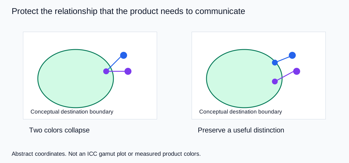
The drawing deliberately uses abstract coordinates rather than pretending a web image can display an unavailable target color. It shows the decision: identify a threatened distinction, compare output treatments, and approve the best faithful representation available for the job.
Build one output-specific proof copy
Keep the original master unchanged. Make a named proof copy for the exact output, such as “linen-card-matte-paper-proof.” Obtain the output profile and file instructions from the printer or destination. A printer profile used for a preview is not automatically the profile they want embedded in the submitted artwork.
Enable the appropriate soft proof in a color-managed editor. Compare the proof view with the master, then inspect warnings as a diagnostic overlay. Turn the overlay off again to judge the actual appearance. A large warning area is a reason to investigate, not an instruction to desaturate the entire picture.
If an important relationship collapses, try a restrained local adjustment in the proof copy. Watch hue, lightness, texture, and neighboring variants together. The best adjustment may be a small compromise that preserves recognition, rather than the most saturated version the output can technically accept.
Record the profile and adjustment with the file. If the printer later changes the paper, revisit the proof. Reusing the previous approved copy without checking the new condition treats an output-specific decision as though it were universal.
Do not confuse conversion with assigning a profile
A profile tells color-managed software how to interpret the image's values. Converting between spaces calculates a new representation for the intended appearance, within the destination's limits. Assigning a different profile changes the interpretation of existing values. Those operations serve different purposes.
I would not assign a different profile simply to make a proof look brighter. If a file arrives without trustworthy color information, investigate its origin and document the uncertainty. A pleasing guess does not become a verified product match because the export contains a profile.
For ordinary web product images, follow the platform's color-space instructions and keep an approved delivery copy. For print, follow the printer's separate requirements. A single file can be convenient, but convenience should not hide different output constraints.
The product color correction workflow addresses capture, neutral references, and edits that change the actual shade. Solve those problems first. Proofing cannot establish what the product originally looked like if the source was already inaccurate.
Use a small physical proof for consequential print work
A soft proof is a prediction within a managed viewing workflow. A physical sample tests the chosen output more directly. For the fabric card, include the two difficult variants, a neutral patch, and a crop with meaningful texture. Use the same paper and production settings planned for the final order.
Compare under consistent light. Record whether the two variants remain distinguishable and whether the texture still reads. Do not chase an exact screen-to-paper match by changing the monitor every time the viewing light changes. The display and print guide explains that separate viewing problem.
If reproduction cannot communicate a subtle difference adequately, support the image with accurate variant names and a useful product description. Do not exaggerate a shade difference beyond the real item just to make a small printed swatch easier to distinguish.
Download the output proof log to record source, target, critical comparison, adjustment, and approval. The blank fields are intentional: they should contain evidence from your own production, not borrowed claims about another printer.
How QuestStudio helps without promising color certification
Use Image Lab to explore a supporting scene or alternative composition around an approved product reference. Review whether the generation changes the product shade before doing any output proofing. A visually appealing background does not establish color accuracy.
Keep precise color conversion, soft proofing, and printer preparation in an editor that supports the required color-management workflow. QuestStudio source creation and print approval are different steps. A prompt naming a hex code cannot certify how a textured fabric will reproduce on a specific paper.
My recommendation is to approve the source, identify the output, protect the essential color relationships, and keep a traceable proof. That sequence gives you a defensible reason to accept a compromise or return to the source.
Frequently asked questions
Does out of gamut mean the image is broken?
No. It means a color lies outside a specified destination range. Identify that destination before deciding whether the difference matters.
Will a 16-bit file fix out-of-gamut colors?
Not by itself. Precision and gamut are different properties. A printer or display still has limits on the colors it can reproduce.
Should I desaturate every area covered by a warning?
No. Inspect the output appearance and important relationships. Use targeted changes when a meaningful distinction is lost.
Can a web diagram show an exact unprintable color?
It cannot establish the appearance of an unavailable printer color. Our diagram is conceptual, not an ICC measurement or product proof.
Does an AI prompt containing a hex code guarantee accurate merchandise color?
No. Compare the result with an approved source and use an appropriate output proof. Material, lighting, generation, and reproduction can each change appearance.
Technical references
Continue with a useful next step
 Image
Product Photo Color Correction: Keep the Real Shade
Correct product photo color without changing the item. Follow a reference-led workflow for white balance, local casts, AI edits and final export checks.
 Image
Monitor Calibration for Photo Printing: Fix Dark Prints
Work out why photo prints look too dark. Compare viewing light, calibrate and profile the display, then soft-proof with the exact paper profile. Test a small proof.
 Image
8-Bit vs 16-Bit Images: Choose an Editing Master
Choose 8-bit or 16-bit image editing with a clear master-to-export workflow. Use an original tonal experiment to understand precision and its practical limits.
Hero: AI-generated editorial illustration. Supporting diagrams and exercises: QuestStudio.