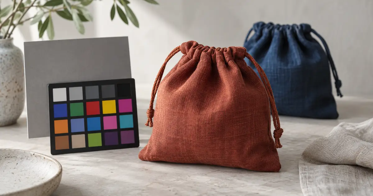

Product photo color correction starts with a trustworthy reference, not a saturation slider. Correct the source lighting and exposure, check the actual product shade, then protect that approved version through any AI edit. Review the downloaded file and the uploaded listing separately.
Imagine a rust-colored linen pouch that becomes bright orange when placed in a generated kitchen scene. The new scene may look attractive, but it no longer describes the same item. This guide follows that fictional pouch through a correction and handoff process. The goal is a defensible match under controlled viewing conditions, not a promise that every customer's screen will look identical.
Find the stage where the shade changed
Put the original capture, the corrected master, the AI result and the exported file beside each other. Do this before making another adjustment. If the original already looks orange, investigate capture and white balance. If the source is right but the AI version changes, the generation step is responsible. If only the uploaded version differs, inspect export and platform processing.
Use the same application, display and viewing conditions for the first comparison. Two different phones with automatic brightness can create a false editing problem. Turn off temporary warm-screen modes while judging color. A calibrated display helps establish a repeatable reference, but it cannot control the displays of everyone who sees the photo.
Keep a copy of each stage. Repeatedly editing the latest compressed download makes it harder to identify the original mistake and can damage the image even when the color seems better.
Capture a neutral reference in the product's light
Photograph a neutral gray card beside the pouch, receiving the same light. Then photograph the pouch without the card. Keep the light position and camera settings stable between those frames. If daylight changes or you move the setup, capture a fresh reference rather than assuming the earlier correction still applies.
A gray card provides a neutral starting point for white balance. It does not certify every fabric color. Shiny thread, fluorescent dyes and textured surfaces can behave differently under different lights. Photograph color-critical items under a consistent light source and retain the physical sample or an approved reference image for review.
Avoid treating any white-looking object as a neutral standard. Cream paper, off-white fabric and a wall reflecting nearby greenery can all mislead the eyedropper. If the only available source is a compressed photo without a reference, record that limitation and make a restrained correction. Do not describe the result as an exact color match.
Correct globally before fixing individual areas
In a photo editor with white-balance and tonal controls, use the reference to establish a starting neutral point. Adjust exposure so texture remains visible in the pouch's highlights and folds. Avoid clipping a color channel: a bright patch without detail cannot be recovered simply by reducing saturation later.
Next, inspect the whole item. If the entire pouch is too warm, a global adjustment may be appropriate. If only the left edge is green from a nearby plant, correct that area with a local mask. A global tint correction for a local reflection can make the rest of the fabric wrong.
Adobe's color adjustment guidance explains working with adjustment layers and targeted corrections. Preserve an editable master so you can revise the correction without rebuilding the entire photo. Use whichever editor gives you the controls the image needs.
Separate an unwanted cast from real material behavior
The pouch should not be the same RGB value at every point. Folds, shadows and the direction of the weave change its appearance. Flattening those variations to a single sampled swatch removes the information that makes fabric believable.
| Observation | Useful check | Next action |
|---|---|---|
| Everything looks orange | Reference card and skin or neutral objects also shift | Review global white balance |
| One edge looks green | Nearby green object reflects onto the fabric | Remove the reflection at capture or correct locally |
| Highlights look lighter | Texture remains and the source shows the same change | Preserve believable shading |
| AI output invents a new colorway | Compare with the approved source | Reject or preserve the real product in a composite |
A brand hex code is useful for flat graphic elements. It is not a complete photographic description of cloth. Do not force the entire product to that value, or use an AI prompt containing the code as proof of accurate reproduction.
How QuestStudio helps after the source is approved
Use Image Lab for a limited reference-based edit when the selected model supports it. State what may change and what must remain. Keep the approved source visible during review because a preservation instruction reduces ambiguity without guaranteeing unchanged pixels.
Attach the actual reference before running the edit. If repeated results alter the fabric, generate the setting separately and composite the original product in a layer editor. Match light and perspective there. The background replacement workflow covers that handoff in more detail.
Review neighboring shades together
If the shop sells rust, terracotta and orange, review all three in one contact sheet. A correction that looks reasonable alone may collapse two distinct variants into the same shade. Include the SKU beside each thumbnail in the review document, keeping those labels outside the customer-facing product photo.
Approve the source and derivative for each variant. Do not copy the rust adjustment blindly to a different material or lighting setup. Group images by capture conditions, then check the individual exceptions. The broader catalog consistency workflow helps manage the set after these color decisions are established.
Download the color handoff worksheet. Record the source filename, light setup, reference frame, edit stage and reason for rejection. “Too warm after background edit” is an actionable note; “make premium” is not.
Check the delivered file, then the delivered page
Export with the color space required by the destination. For ordinary web delivery, an sRGB conversion is a practical starting point unless the platform specifies otherwise. Converting colors and merely assigning a different profile are different operations. Keep the working master with its original color-management information.
Reopen the export in a color-managed viewer. Check the same fabric areas you approved earlier, then inspect the page after upload. Review both the full image and the small variant thumbnail. If the platform changes the file, retain the local approved version so you can compare them.
Finish with a phone check for obvious problems, not as a new master reference. The acceptance question is whether the photo preserves the approved product appearance through the workflow. Customer displays, room lighting and individual perception still vary.
Frequently asked questions
Can AI make a product photo color accurate?
AI can assist an edit, but accuracy requires a trustworthy source and review. A prompt alone cannot verify the physical item's shade or prevent every color change.
Is a gray card enough for every product?
It helps establish neutral white balance for that lighting setup. Difficult dyes, reflective materials and close color variants may need additional references and a more controlled color workflow.
Should every part of the product match its hex code?
No. Real highlights, folds and shadows vary. A single hex value does not describe the full appearance of a three-dimensional material.
Why does the image look different on a phone?
Display settings, color handling, brightness and surrounding light can differ. Establish one controlled approval reference, then use other devices to catch obvious delivery problems.
Can I fix mixed lighting after the shoot?
Sometimes, using local corrections, but one global white balance may not fix every area. If the item is color critical and the source is poor, a controlled reshoot may be more reliable.
Approve the color before the atmosphere
Start with one difficult shade and one reference frame. Once the exported product matches the approved source, use that file for the next controlled edit in Image Lab.
Hero image: AI-generated editorial illustration. Examples are original planning exercises, not measured model tests.