
To put an image inside text in Canva, use letter-shaped frames. On desktop, open Elements, search for a letter frame such as “C frame,” and add the frame to the page. Drag your photo onto it until Canva shows the image inside the letter. Build the rest of the word with matching frames, then double-click each filled letter to adjust its crop.
For a one-letter monogram, that is usually enough. For a word such as COVE, four default crops of the same photo can look like four copies of the same shoreline. Decide whether you want a continuous picture or a different detail in each letter before spending time on alignment.
Build the word before adding the photo
Start with a short word and a solid background. Choose chunky letters with enough interior area to show the photograph. Search for the first letter, then look for matching shapes in the same style. Letter frames are separate design objects, so the font picker for an ordinary text box will not turn them into a new word. You can keep a regular text version off to the side as a spacing guide while assembling the frames.
Set a common height visually and line up the baseline. Check the spaces by eye: the opening beside a V looks different from the rectangular gap beside an E even at the same numeric spacing. Leave visible room for the center hole of an O or A. If the spacing looks strange with empty frames, adding a busy image will make the problem harder to diagnose.
Confirm you chose actual frames. An image should visibly drop into the letter. If it lands as a rectangle over the letter, undo, move the photo over the filled part of the letter and try again. A decorative letter or sticker can resemble a frame in search results but behaves like a graphic. Canva describes how to add and adjust media in frames.
Choose a photo that works through narrow openings
Pick a source with one big shape, a consistent line, or a color transition that survives small crops. A coast has a horizon and distinct bands of sky and water. A photo with five equally important faces asks far more from the letter shapes. If a face lands in the hole of an O, repositioning one letter may simply create a broken seam with the next one. Choose a new source or use the photo separately.
Make a plain text version early and duplicate the design page. You now have a quick visual control for legibility. Preview both at thumbnail size. If the photo-filled version needs a second read to identify the word, give it more contrast or reserve it for a decorative title with ordinary text nearby.
Fill and align the letters on Canva desktop
- Upload the photo or choose a source you can use. Drag it into the first frame and wait for the preview to fill the letter.
- Put the same source into every frame for a continuous image, or choose an intentional set of different images for a collage.
- Double-click a filled frame. Resize or reposition the image inside that frame, then finish the crop. Leave the letter itself on its baseline.
- Repeat across the word. For a continuous picture, keep the crop scale as similar as possible across frames and move the source horizontally so later letters reveal later parts of the photo.
- Group the completed frames if you need to move the word together. Keep the editable Canva page for any future crop or copy changes.
If an existing frame has the right placement but the wrong image, see the Canva frame replacement walkthrough. Here the extra work is making several independently positioned crops read as one image.
Worked example: make one horizon run across COVE
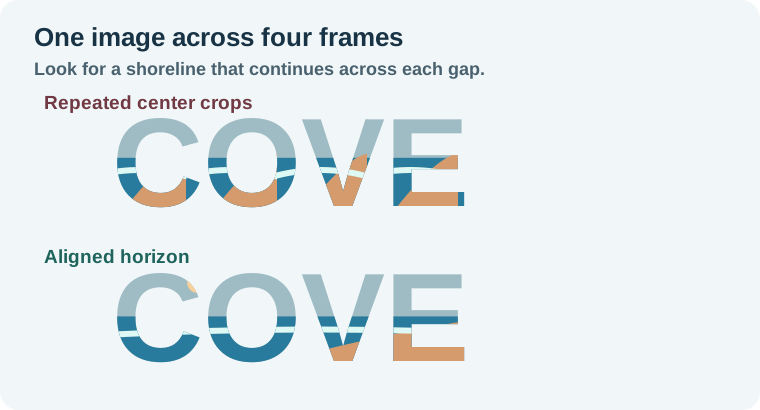
Start with a wide coastal photograph. Set COVE across the upper half of a dark blue poster. In the C, position the horizon slightly above the middle of the letter. Use that height as a guide for every other frame. In the O, slide the source left so the next section of coastline appears, then do the same in the V and E. Keep the photo's scale consistent by watching the width of a distinctive wave or headland as it passes between letters.
The goal is a believable progression. The left edge can show open water, the middle can show waves, and the right can show a headland. If a white wave repeats in all four letters, you probably still have four default center crops. If the headland jumps upward between V and E, fix the vertical crop in one of those two frames and inspect the word again.
For a collage version, give each letter a deliberate role instead. C can carry water, O can carry the sun, V can show rock, and E can hold sky. In that case you can vary the crop scale. Keep a shared palette so the four frames still belong to the same headline.
Check what the exported design communicates
Export a proof at the destination size and open it outside Canva. Check that the word reads at a glance, especially where the photo gets close in brightness to the background. A light sky disappearing into a white page can erase the top of an E. A solid background or a simpler source image will often help more than a heavy stroke.
A finished PNG contains pixels, so a reader or search engine will not get a semantic title from the letter frames. On a website or accessible document, include the words in the surrounding text or the appropriate alternative text for the image's role. Use the Canva text box guide when you need ordinary editable text, such as dates or event details.
How QuestStudio helps
Use Image Lab to prepare a wide, low-clutter source if your current photo is too busy. Ask for one strong horizontal feature and quiet tones, then do the actual letter layout and crop in Canva. A background that reads through a few inches of screen space is easier to work with than one that depends on fine detail.
Once the proof reads at its smallest size, save the Canva source and keep the exported version beside it. The crop plan is useful if you later need the same lettering in a square social tile or a wider banner.
Download the letter-frame crop plan.
Frequently asked questions
Can I fill a normal Canva text box with a photo this way?
The workflow uses letter-shaped frames. An ordinary text box remains type and behaves differently.
Why does the photo cover the whole letter?
Check that the letter is a frame. Drag the photo onto the frame and wait for the contained preview before dropping it.
How do I make the photo line up across all letters?
Keep a similar crop scale, align a visible horizontal reference, and move each successive crop to reveal a different part of the source.
What if one letter looks like a different font?
Find a consistent frame set or shorten the word. Mixing very different shapes can make the headline harder to read.
Can I change the word after exporting it as PNG?
Change the frames in the original Canva design and export again. The PNG is a flattened image.