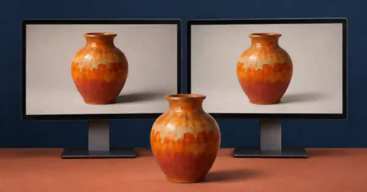

If the product photo on your laptop and the exported video show different shadow detail, I recommend checking the color pipeline before reaching for a saturation slider. For a conventional SDR product edit, I start with a correctly interpreted still and a Rec. 709 delivery sequence, then compare the export in the place the customer will see it. That sequence of checks helps me avoid grading around a player or display difference.
My gear pick for this setup
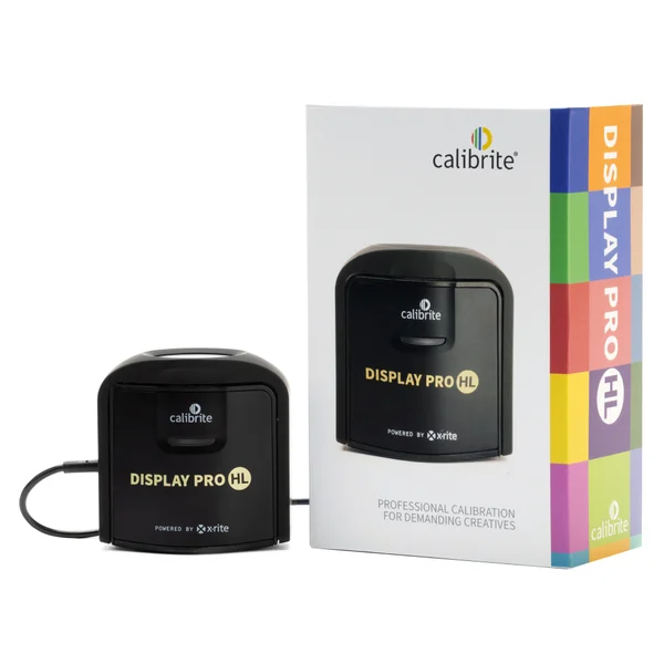
Calibrite Display Pro HL
A colorimeter for a display you use to approve work
I’d consider the Display Pro HL when display profiling is the part of the workflow you need to improve. Check current software compatibility and verify your file’s color tags separately.
Give each file a known starting point
sRGB is a common profile for web still images. Rec. 709 is commonly used for SDR HD video. They use the same primary chromaticities and D65 white point, but their transfer functions and typical viewing assumptions differ. The similar gamut names can make two files feel interchangeable when the software still has to know how to interpret their values. A tagged image has information the editor can use. An untagged one may be interpreted according to the editor’s defaults.
I ask for the approved product still with its embedded profile and keep it unchanged in the source folder. If the approved image already comes in sRGB, keep that profile. When converting from another profile for a specific use, use a color-managed conversion. Assigning a new profile to the same values changes their interpretation. It can create the very color difference you were trying to fix.
Make a short sequence with an approved reference
For a handmade terracotta vase, I would put the approved still beside one video shot under steady light. A reference frame with a light area, a shaded edge and a clearly visible product color makes a useful comparison. If the video source is log or HDR, identify its camera color space and transfer curve before you apply a transform. Leave the still’s interpretation independent of that footage. A camera LUT applied to everything can make the still darker or more saturated than intended.
Choose a conventional SDR output when that is the requested deliverable. In a color-managed editor, verify the input color interpretation, the sequence or working space, and the output space. A working space can be wider than the delivery space when the editor handles the transform. The critical point is knowing which conversion occurs at each stage. I put those settings in the review note so a later editor can reopen the same test.
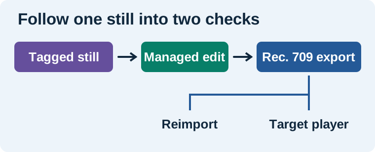
Compare the export inside and outside the editor
Export five seconds with the intended delivery settings. Bring the exported file back into the editor and check its interpretation. Compare the same frame in the sequence and the reimport with any comparison effects disabled. Use the waveform to check whether shadows and highlights have moved in the decoded export. A waveform can show a level change, but it does not certify the appearance of a particular physical display. Inspect the product and its approved color reference as well.
Open the same export in the target player or browser on the same screen. Keep brightness, ambient light and display modes steady. If the reimport matches and only the player looks lighter, check the player or viewer gamma behavior before changing the grade. If both the reimport and player show a change, verify the sequence output and export metadata. A preview setting can affect what the editor shows without modifying the encoded file.
Use the symptom to find the stage
| What changes | First check |
|---|---|
| Still changes as soon as it enters the sequence | Check the embedded profile and import interpretation. |
| Only log footage looks flat | Check input identification and the intended transform. |
| Reimport differs from the timeline | Check output color space, tags and level handling. |
| Reimport matches but a player looks brighter | Check viewing behavior on the same display. |
| Two displays look different | Use the controlled review screen for approval and compare under stable lighting. |
Give the portable display a separate review job
I prefer to use a portable screen for reference, timelines or a second opinion when I have a controlled display available for approval. Give a reviewer the same frame and a short instruction about what to check, such as “does the shaded side still read as terracotta, and can you see the embossing?” A generic request to make the image “match” often mixes hue, brightness and viewing differences. The display calibration guide explains where profiling fits. The portable monitor guide covers assigning a useful role to a travel display.
Keep the source photo beside the generated variation
In Image Lab, I recommend retaining the approved still while experimenting with the background or lighting. Download the chosen result and compare its product region with the original under the same viewing conditions before using it in video. Then run the short export test. That gives you a clean point of comparison if color shifts between the generated image, the sequence and the delivered file.
Compare three views of the same frame
I would make a short card showing an approved terracotta still on one half and a video frame of the vase on the other. Export it, then open the same frame in the sequence, the reimported file and the target player. Track two observations separately in the worksheet. First note whether the shadow and highlight positions agree when the files are interpreted in the same editor. Then note whether the target viewer changes how the same file looks on the same display. Keep the approved still with the test so a reviewer can see which changes came from the source and which appeared later.
Download the color management worksheet (CSV)
Frequently asked questions
Can I put an sRGB JPEG in a Rec. 709 timeline?
Yes. Check the still's embedded profile and your editor's input interpretation, then allow the color-managed workflow to convert it for the sequence and export.
Are sRGB and Rec. 709 identical?
They share primary chromaticities and a D65 white point. Their transfer functions and viewing conventions differ, so verify how a specific file is tagged and displayed.
Why does an export look lighter in another player?
Players and displays can apply different viewing behavior. Reimport the file into the same editor and compare the same frame before changing the grade.
Can a monitor calibration fix an export tag?
Calibration and profiling affect the display workflow. If an export has incorrect color tags or level handling, inspect and correct the file or output settings separately.
Sources and further reading
Affiliate disclosure
As an Amazon Associate I earn from qualifying purchases.
Continue with a useful next step
 Image
Monitor Calibrators for Photo Editing: Pro HL Guide
Decide whether a monitor calibrator helps your photo workflow. Review Calibrite Display Pro HL support, profiling limits and a repeatable product-color check.
 Image
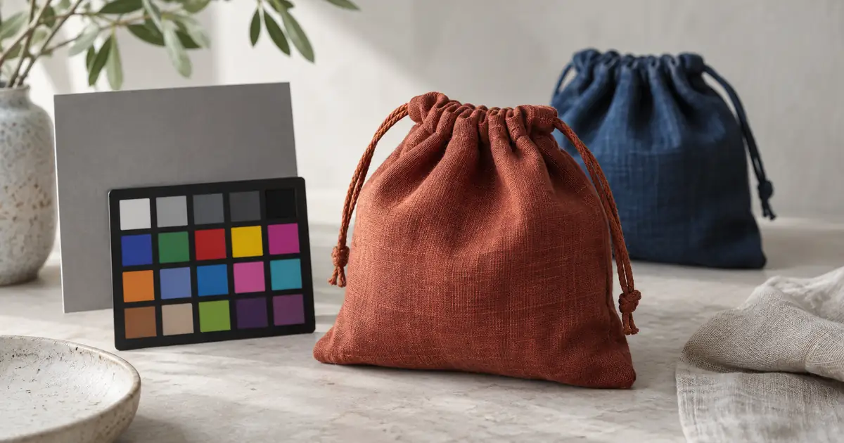
Product Photo Color Correction: Keep the Real Shade
Correct product photo color without changing the item. Follow a reference-led workflow for white balance, local casts, AI edits and final export checks.
 Video
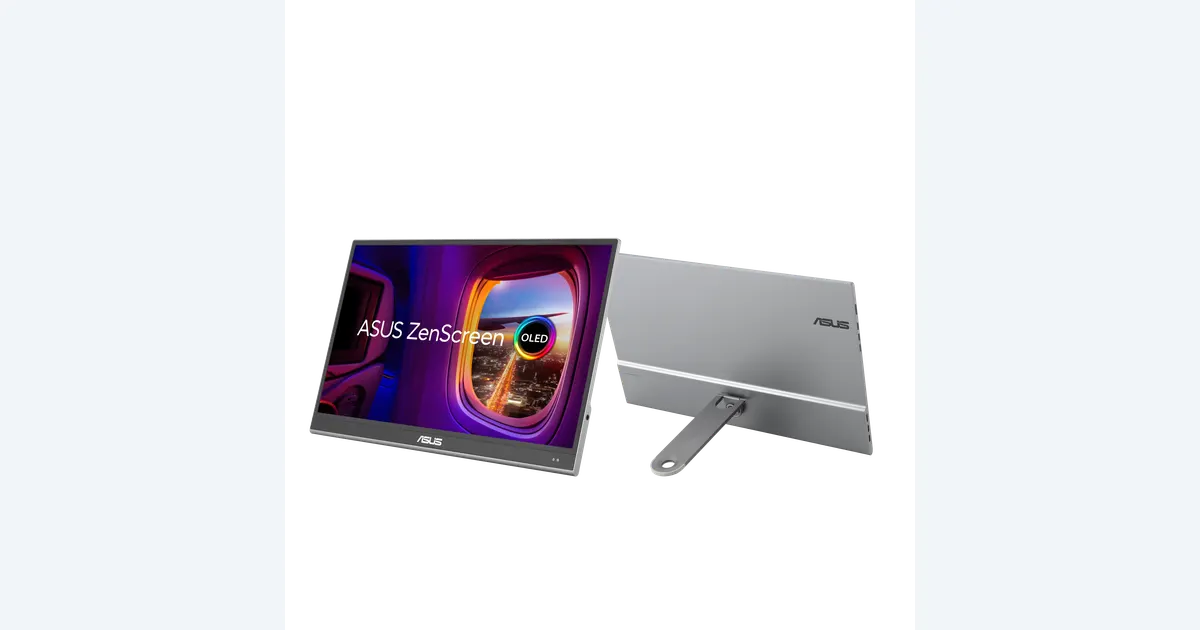
Portable Monitors for Photo and Video Review: What Fits?
Plan a portable photo and video review screen. Check ASUS MQ16AHE connections, power, OLED care and SDR workflow before treating it as a reference display.