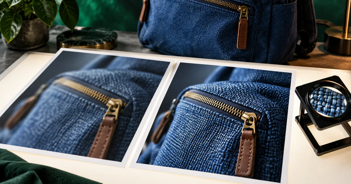

An enhanced image can look sharper and become less accurate at the same time. The zipper gains extra teeth. The fabric turns into a different weave. A soft reflection becomes an invented seam. This Krea enhancer tutorial starts with the decision that matters most: which details are allowed to change?
Download the enhancement fidelity review · Create a clean source in Image Lab
Feature information checked September 17, 2026. The backpack review is an original inspection exercise, not a measured Krea before-and-after result. The hero is an AI-generated editorial illustration.
Choose resizing or generative enhancement deliberately
Krea distinguishes Quick Upscale from its Enhancer workflow. Its current Magnific enhancement guide describes selecting an image, choosing the Magnific Generative Enhancer model, adjusting the scale and settings, and comparing the result. Generative enhancement can create plausible detail; it is not evidence that the new texture existed in the source.
Use a conventional resize when the goal is simply to deliver more pixels while keeping the image’s content stable. Consider generative enhancement when invented detail is acceptable or when you can inspect and reject unwanted changes. An illustration for a mood board allows different liberties from a catalog photograph of a particular bag.
Write the intended use in one sentence. “A social graphic that communicates a rugged outdoor mood” and “a product image showing the exact pocket construction” are different assignments. The correct setting cannot be chosen without knowing which assignment you have.
Make a source-detail map before touching sliders
Our exercise uses a blue fabric backpack with a brass zipper, a brown pull tab, and a curved front-panel seam. Divide the image into three categories: exact details, approximate texture, and freely editable surroundings. This takes less time than comparing every pixel after several generations.
| Area | What must survive | What may change |
|---|---|---|
| Zipper and pull | One zipper path, attachment, pull shape | Slightly clearer edges |
| Panel seam | Position and direction | Visibility of existing stitching |
| Fabric | Color and general material character | Limited plausible texture, if the use permits it |
| Background | Product silhouette and believable contact | Noise and minor unimportant texture |
A label, serial number, ingredient list, or meaningful symbol belongs in the exact category. Do not use invented sharpening to reconstruct unreadable factual text. Obtain a clearer source or add verified typography separately when the design permits it.
Keep a resize baseline at the same output size
Suppose a 1200-by-800 source needs a 2400-by-1600 delivery. Make a straightforward 2× resized copy before running an enhancer. This gives you a fair comparison: both candidates have the same output dimensions, so you are judging the enhancement rather than simply favoring the larger display.
Check whether that size is actually required. A 1080-pixel social placement may not benefit from a huge intermediate file. Print needs depend on physical dimensions and intended viewing distance; the print-on-demand upscaling workflow covers that separate delivery decision.
Retain the original file, including an untouched copy if it came from a camera or a client. Avoid comparing an enhancement against a screenshot of the original: the screenshot adds another resize and compression step that can bias the judgment.
Run one conservative enhancement, then inspect it
- Upload or select the source image in the relevant Krea enhancement workspace.
- Confirm the chosen model and output scale. Record them with the file.
- Start with restrained settings appropriate to that model rather than copying values from a different interface.
- Generate one useful comparison and inspect it against the source.
- Change a single setting only after identifying a specific failure.
Names such as strength, resemblance, creativity, or sharpening do not have universal numerical meanings across tools. A value of zero is not necessarily a “preserve everything” command. Read the labels in your current interface and judge the output. The model choice can matter as much as the slider.
If a text description is available, describe visible material and fixed features without adding aspirational details. “Blue woven fabric with one brass zipper and a brown pull tab” is a better constraint for this exercise than “luxury technical backpack with intricate premium stitching.” The second description invites a design change.
Review the whole image before inspecting tiny crops
Start at the final viewing size. Does the bag still look like the source? Has the color shifted? Are the shadows too dramatic for the rest of the campaign? A result that impresses at 400% zoom can look brittle and oversharpened on a phone.
Next, compare three fixed crops at matched scale: the zipper junction, the panel seam, and a plain fabric area. Include some surrounding context so you can see whether a new texture crosses a seam or changes the shape. Do not inspect only the most flattering patch.
Finally, look at the outline against the background. Halos, false threads, and bright edge ringing may be less noticeable inside the image than at the silhouette. Check small holes and straps where the model might merge separate shapes.
Distinguish recovered readability from invented structure
A previously soft edge becoming easier to see is not the same as a new edge appearing. Ask whether the source supports the feature. If the original shows a single seam and the enhancement shows two parallel seams, you have a structural change even if both look realistic.
For texture, compare its direction and relationship to the object. Woven fabric should not flow independently across zipper hardware. A high-frequency pattern that looks impressive in isolation may ignore the surface it is supposed to describe.
| Observation | Decision | Next step |
|---|---|---|
| Cleaner edge, unchanged shape | Potentially useful | Check final-size export |
| New seam or altered zipper | Reject for exact product work | Reduce generative change or use the baseline |
| Plausible but unsupported weave | Depends on purpose | Use only where illustrative detail is acceptable |
| Good bag, noisy background | Possible local repair | Repair the background without replacing approved product detail |
A hybrid edit can be appropriate when one small region needs repair and the rest is useful. Keep a mask and the source layers so the adjustment remains reviewable. If many exact details need restoring, the ordinary resize may be the more reliable final asset.
Finish for the actual placement
Export the candidate in the intended dimensions and format, then reopen that file. Compression can flatten subtle texture, create ringing near edges, or exaggerate a previously acceptable pattern. Approval of the editor preview is not approval of the file your audience will receive.
Record a short reason for acceptance: “Zipper path and seam unchanged; no halo at mobile size; color matches the campaign.” This is more useful than saving a file called final-final-sharp. Keep the baseline nearby so the next person can reverse the enhancement if a later use demands greater fidelity.
If you need to improve the underlying composition first, build a cleaner source in QuestStudio Image Lab. Krea enhancement is a separate step in Krea. An enhancer should not be asked to solve an unclear subject, a poor crop, and missing product evidence simultaneously. Start with an image that already communicates the right thing.
Frequently asked questions
Can Krea recover the exact detail missing from a small image?
Generative detail can be plausible without being historically accurate. Treat unreadable factual details and exact product features as unresolved unless the source supports them.
Why compare against an ordinary resize?
It separates the benefit of more pixels from the benefit or harm of generated detail. Match output dimensions and viewing size before judging.
Is the sharpest version always the best?
No. Choose the version that preserves the required content and looks appropriate at delivery size. Excess texture and edge halos can make an image less usable.
When should I stop trying stronger settings?
Stop when extra detail changes identifying features or fails to improve the final placement. Keep the restrained result, use local repair, or return to the resize baseline.