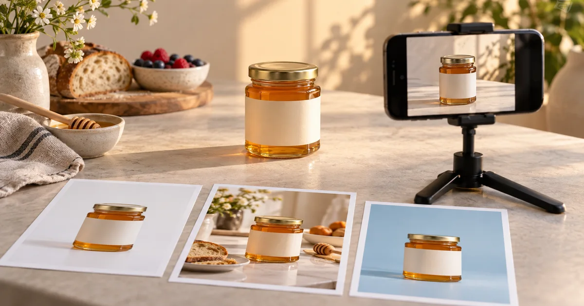

A matching color palette does not make a product campaign accurate. The jar can become taller, the lid can change, and a background prop can imply an ingredient the product does not contain. Google Pomelli Photoshoot is most useful when brand consistency and product truth are reviewed as separate requirements.
Download the product campaign approval sheet · Plan your product scene in Image Lab
Feature information checked September 17, 2026. The honey-jar campaign is an original planning example, not a reported Pomelli generation. The hero is an AI-generated editorial illustration.
Review Business DNA before generating a campaign
Pomelli’s Business DNA holds brand information such as colors, fonts, imagery, and business context. Google documents creating it from a website or starting manually, then reviewing and editing the result. Treat the extracted profile as a draft: a website can contain old campaign colors, stock photography, or pages that do not represent the current brand. See Google’s Business DNA instructions.
For a small food maker, “warm and handcrafted” is too broad to be an approval rule. Make it concrete: cream backgrounds, natural side light, restrained props, readable packaging, and no invented awards. If the website includes a winter promotion, decide whether those seasonal elements belong in this campaign before reusing them.
Review brand tone separately from visual style. A playful background may be acceptable while playful health claims are not. The image generator should not become the authority for ingredients, certifications, quantity, or promotional terms.
Define a three-image set with three different jobs
Our fictional campaign starts with an amber honey jar and a plain cream label. It needs a clean product image, a breakfast scene, and a seasonal banner. These are not three random variations of the same prompt. Each asset answers a different question for the viewer.
| Asset | Viewer’s question | Visual requirement | Reject when |
|---|---|---|---|
| Product view | What am I buying? | Clear jar, lid, label, and proportions | Packaging changes |
| Breakfast scene | How might I use it? | Believable table setting with the jar dominant | Props imply an unsupported product variant |
| Seasonal banner | What is this campaign about? | Recognizable jar and copy-safe space | The crop obscures the product or offer area |
Keep the catalog image conservative. It establishes a reference customers can compare with the other assets. The lifestyle image has more creative freedom, but the product should still look like the one on the landing page.
Prepare a photograph that resolves product details
Use a sharp source with the entire product visible, a clear outline, and light that reveals the important surfaces. Remove unrelated packaging if it could be mistaken for part of the product. A small, angled photograph with glare across the label gives the system too little evidence.
Keep a separate close reference for exact label content even if the generation interface accepts only one principal product image. You need it for review. The goal is not to persuade the model to guess better; it is to know when the output no longer represents what you sell.
For the honey jar, record the lid color, shoulder shape, label position, glass proportions, and fill level. Choose two or three of those as immediate rejection checks. That keeps review consistent when several appealing variations arrive together.
Use Photoshoot templates as a starting composition
The current Pomelli Photoshoot help describes selecting a product image, choosing preset or custom templates, generating, and reviewing or editing the results. It documents selecting up to six templates, so older tutorials describing four may not match the current workflow. Custom styling can use a prompt or reference through the available controls.
Choose templates because they serve the three asset jobs, not because they maximize variety. If every output uses a different lighting direction, camera height, and color palette, you will spend more time trying to make the set feel related.
This proposed custom direction describes an art-direction goal, not a guarantee of preservation. Keep the source visible beside the output. If an exact packaging feature changes, the image fails even when the scene looks convincing.
Check product truth before brand polish
Review the jar first, then the set. Does the lid fit the same way? Is the glass still the same shape? Has the label gained text, a badge, or an ingredient illustration? Is the apparent quantity misleading? These are product questions, and they should be answered before discussing the background color.
Next, examine what the props imply. Flowers may suggest a floral variety; nuts may suggest an ingredient or serving suggestion that needs deliberate consideration. Use props with a clear purpose and make the final copy accurate. An attractive visual association can become an unintended claim when placed beside a product offer.
Finally, review the brand direction: color family, light softness, background density, and camera height. Consistency does not mean identical backgrounds. The set can vary while preserving the same product identity and visual priorities.
Test the actual crops before approving a set
A wide banner and a square product card do not have the same safe area. Preview each image in its intended placement. The jar may be recognizable in the full image but disappear behind a mobile headline or get cropped at the lid in a card.
Make a simple placement mockup with real text. Do not use placeholder copy that is half the length of the planned offer. Check the logo, call to action, price if applicable, and the product itself at normal phone size. This is where empty space either earns its place or proves insufficient.
If a crop fails, decide whether reframing is enough. Regenerate only when the composition cannot support the placement. Cropping and typesetting are editing problems; they do not always require a different product scene.
Keep a small approval record for each asset
| Record | Example entry |
|---|---|
| Source | Approved front-view honey jar photograph |
| Intended use | Breakfast campaign, square social placement |
| Identity checks | Lid, shoulder, label position, and fill level match |
| Claim review | No invented award or ingredient text |
| Delivery review | Final crop and real copy checked on mobile |
Save the exported asset with the source and the approved copy. If the product packaging changes later, you can identify which campaign images need replacing. A folder full of unlabeled variations creates work precisely when you need to move quickly.
Use the product fidelity benchmark to organize a structured review, and explore a background composition in QuestStudio Image Lab when the scene direction is still uncertain. Pomelli’s Business DNA and Photoshoot remain separate external features. Continue with the product-photo approval checklist before publishing a campaign.
Frequently asked questions
Does Business DNA guarantee that every image matches my brand?
No. It supplies brand context, but you still need to review the extracted information and the final images. Product identity and campaign claims require their own checks.
Should all campaign images use the same template?
Not necessarily. Choose templates for different jobs while keeping the product, light, palette, and visual priorities coherent across the set.
Can generated label text replace my packaging artwork?
Do not rely on generated text for exact packaging. Compare against approved artwork and use a faithful source or a controlled design step when exact wording matters.
What is the fastest useful first campaign?
Start with one clear product view, one relevant lifestyle scene, and one planned banner crop. Approve those before expanding to more variations.