
AI card game art needs to do more than look consistent. Players must tell cards apart, read their rules and recognize what they are holding without studying every illustration. Start with a small set, define each card's job, and keep the artwork separate from the frame and rules text.
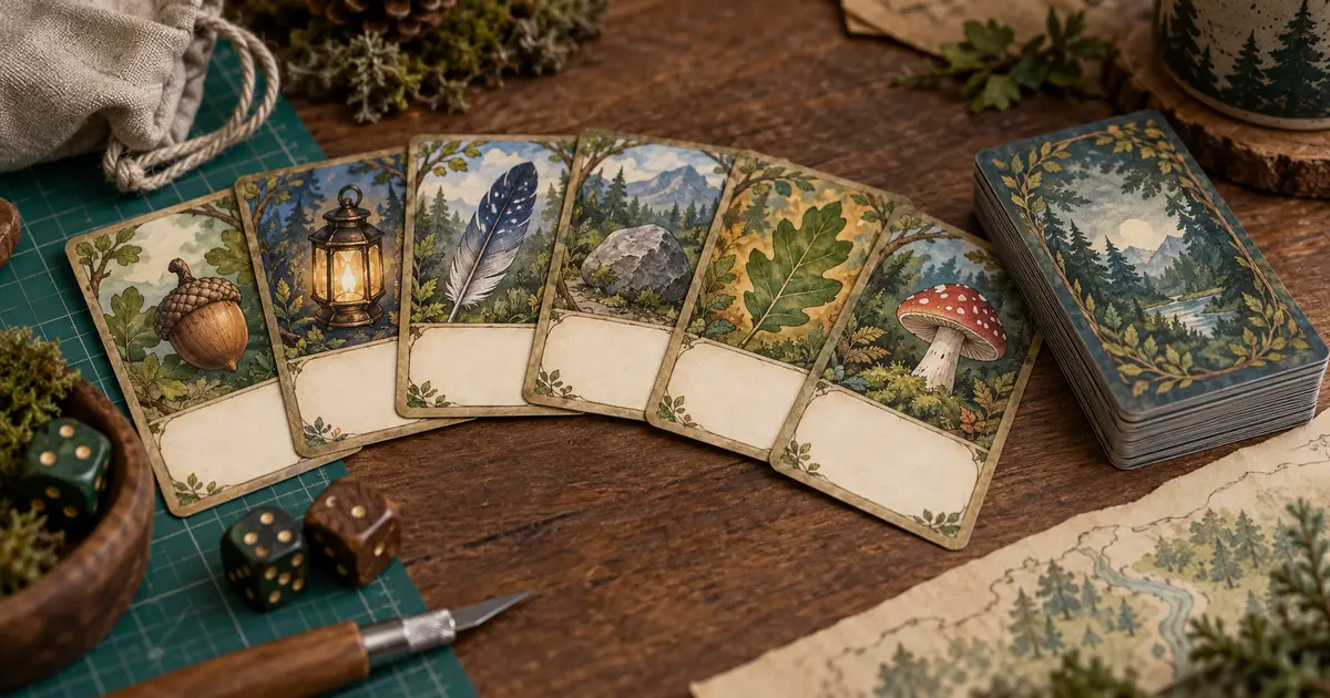
Our original exercise is a six-card woodland resource deck: acorn, lantern, feather, stone, leaf and mushroom. It is a production plan, not a tested game or a finished printable download. Download the card-art matrix and replace the resources with the categories your game actually uses.
Decide what the illustration must communicate
Before generating art, describe the information players need at a glance. In this example, each resource has a distinct object silhouette. The illustration identifies the resource; a separate icon and word reinforce that identity. The image does not need to explain an entire forest story.
Do a rough paper prototype first. Use handwritten names and simple shapes to check that the categories are understandable. If players confuse two resources because their rules are too similar, polished artwork will not resolve the game-design problem. Adjust the rules or naming before committing to a large visual set.
Keep the resource identity stable across revisions. If “stone” becomes a crystal halfway through production, update its icon, rules references and file records together. Otherwise you can end up with a coherent-looking deck whose illustrations no longer match the approved rules.
Build the card template around real content
Set the final card dimensions from your chosen printer or digital destination. Create separate areas for the resource name, illustration, icon and rules. Test the longest real rule in the template. A layout that works only with “Gain one” may fail when a card needs a conditional instruction.
Generate for the shape of the illustration window, which may differ from the full card. A portrait card can contain a wide art window. If you generate the entire card as a single image, each rule change can force unnecessary retouching and introduce inconsistent lettering.
Ludo's card-art documentation also separates the generated illustration from text and frames. Use that distinction regardless of the image tool. Keep names and numbers in editable layout layers, and use the printer's actual bleed and safe-area template rather than assuming a generic border will fit.
Give each resource a distinct silhouette
The six-card set should share rendering and lighting while preserving clear differences. Our acorn is rounded with a broad cap. The lantern is upright and angular. The feather is long and diagonal. The stone is a low irregular mass. The leaf is broad and asymmetric. The mushroom has a recognizable cap and stem.
| Resource | Main silhouette | Composition choice | Confusion to avoid |
|---|---|---|---|
| Acorn | Rounded body and cap | One large object | Looking like a small stone |
| Lantern | Tall rectangle and handle | Upright central shape | Too much surrounding foliage |
| Feather | Long tapered curve | Diagonal placement | Becoming a thin leaf |
| Stone | Low irregular mass | Low center of gravity | Decorative crystal spikes |
| Leaf | Broad asymmetric shape | Clear stem and edge | Matching the feather's outline |
| Mushroom | Cap above short stem | Open space around stem | Cap merging into the ground |
These are art-direction choices, not promises of exact model behavior. Reject an attractive image if it weakens the category. A feather with dense leaves behind it may be more decorative but harder to recognize in a hand of cards.
Approve one reference before expanding
Choose one illustration that establishes the set's treatment: muted forest colors, visible brush texture, a simple ground plane and gentle upper-left light. Save that source and its prompt. Use it as a reference where the selected model supports references, while checking the resulting art rather than assuming settings enforce consistency.
Generate the other objects against the same approved art direction. Do not make each new image the sole reference for the next one. A chain of small changes can gradually move the final card away from the initial style. Our reference-pack workflow explains how to preserve the source decisions.
Run three recognition checks
First, shrink all six cards to the size they will occupy in play. Look at them together, not as six full-screen images. Check whether one resource is much smaller, darker or more detailed than the others. Adjust the artwork placement before requesting a new generation.
Second, temporarily inspect a grayscale preview in your layout editor. This does not certify accessibility, but it can reveal categories distinguished only by color. The icon, name and object silhouette should still give the player useful information when color differences are less apparent.
Third, show the prototype to someone who has not seen your prompt. Ask them to identify a named resource from the spread. Treat their hesitation as feedback on the specific card, not as a measured usability result from a single informal check. Record the confusion and change the most likely cause.
Repair one card without drifting the set
Suppose the leaf and feather remain too similar. Change the leaf's silhouette first: make it broader with a short visible stem. Keep its palette, lighting and background treatment. Changing all four variables at once makes it harder to understand which change improved recognition.
Use a crop or a local edit when the source is otherwise sound. A branch at the edge may be removable without regenerating the resource. For series-level consistency, the carousel review workflow offers a useful way to inspect a strip of images, although a playable deck also needs identification and collation checks.
Save the revised art under a new version. Update the card matrix so the layout references the approved file. A correctly named but outdated image in the export folder can silently undo the latest review.
Proof the assembled deck, front and back
Put real text into every card and export a proof using the destination's specifications. Check the smallest text, contrast, icons and edge placement at actual size. Leave important content inside the required safe area. Bleed and cutting tolerances vary, so use the current printer template.
Inspect the backs as carefully as the fronts. A visibly different back, crop or print mark can reveal a card's identity when it is supposed to be hidden. Check whether backs need rotational symmetry for your game's handling. This is a play requirement, not just a decorative choice.
Count the exported cards against the rules inventory. If the game needs four acorns and two lanterns, a beautiful file containing one of each is incomplete. Keep a collation list, file order and version number with the print package. Shuffle a physical proof and check the cards in a hand, on the table and under ordinary room lighting.
How QuestStudio helps
Image Lab can help explore the six illustrations and refine individual visual problems. Start with one resource whose silhouette is easy to judge, then compare the set before expanding. The card database, typesetting, print templates and final deck assembly belong in your layout or game-production tools.
Keep the image output separate from the rules. That gives you freedom to rebalance a resource, translate a card or correct a typo without recreating the illustration. The best first deliverable is a small readable prototype, not a large folder of unreviewed fantasy art.
Frequently asked questions
Should AI generate the rules text inside the image?
Keep final rules, names and numbers editable in your layout or game engine. That makes corrections and translations possible without changing the artwork.
Does every card need the same camera angle?
No. Preserve a coherent visual treatment while using composition to distinguish card categories. The player should recognize the resource quickly.
Can one reference guarantee a consistent deck?
No. A reference guides the result, but each image still needs review for scale, palette, rendering, silhouette and unwanted details.
Is a grayscale check enough for accessibility?
No. It is a useful diagnostic for color dependence. Also review text readability, symbols, contrast and the needs of the people who will play.
When should I generate the rest of the deck?
After a small representative set works in the real template and a physical or digital play proof. Resolve the visual system before multiplying it.
Finish six cards before commissioning sixty
A small deck exposes the expensive mistakes early: unreadable rules, ambiguous resources, inconsistent backs and missing quantities. Build the first six illustrations, assemble the actual cards and let the prototype guide the next round of artwork.
Make the first resource illustration in Image Lab
Hero image: AI-generated editorial illustration. Examples are original planning exercises, not measured model tests.