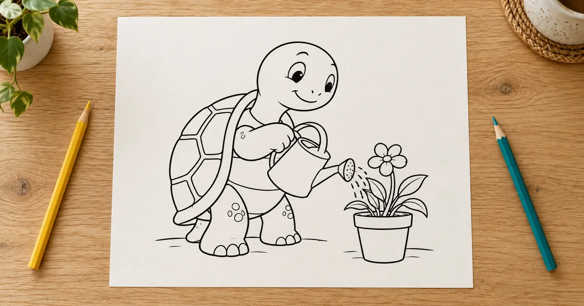

The tortoise looks charming at full-screen size. Printed on paper, its watering can becomes a black knot and half its shell is too small to color. A coloring page needs a different kind of review from a finished illustration.
Download the coloring-page proof sheet · Draft a coloring-page illustration
Editorial guide checked September 13, 2026. Examples and worksheets are original planning material; the hero is an AI-generated illustration, not a model benchmark.
Define the coloring experience before the subject
A coloring page is an activity surface. Its quality depends on the spaces a person can fill, the clarity of the forms, and the way the lines survive printing. A detailed illustration may be impressive yet frustrating to color. Start by deciding whether the page is for broad crayons, ordinary colored pencils, or a finer drawing tool.
For this original exercise, the subject is a tortoise watering one potted plant. The shell has a few generous sections, the watering can has a readable handle, and the plant has distinct leaves. The aim is a relaxed pencil-coloring page with a clear action. It is not an age-certified activity or a claim that every reader prefers the same level of detail.
Write a small content limit: one tortoise, one can, one plant, and no decorative border. That limit protects the useful open areas. If the first generation adds a garden full of flowers, simplify the scene before spending time repairing every leaf.
Ask for line art, then inspect what was actually drawn
Use Image Lab to draft the composition. Describe the action and the large shapes before the style restrictions. A plain background and limited detail make cleanup easier, but the result still needs a semantic review. The generator can produce a plausible outline around an impossible object.
Read the drawing as a small story. Is the tortoise holding the handle, or does the handle pass through its arm? Does water leave the spout? Does the plant grow from the pot? Are the feet attached sensibly? A line-art filter can simplify tone, but it cannot decide whether the scene makes sense.
Cricut’s custom coloring-page announcement describes both photo-based and text-based creation and acknowledges occasional AI inconsistencies. Tool availability makes drafting easier; it does not remove the need to inspect each page before printing.
Check the spaces a person will color
Choose three representative areas: a large shell section, the smallest leaf, and the gap inside the watering-can handle. View the page at intended print size. The large area should feel inviting, the leaf should remain recognizable, and the handle should not become a black knot. If all three require constant zooming to understand, the drawing is too intricate for this brief.
Trace the important boundaries with your eye. A gap where the shell meets the neck can make two forms ambiguous. A line that stops short of the pot rim can make the leaf appear to float. Repair those junctions deliberately. Do not close every decorative line indiscriminately: a crease or a small facial mark may be intended to remain open.
For digital fill use, test enclosed regions with the fill tool on a duplicate layer. If color floods out of a shell section, undo and locate the gap. That test checks containment; it does not prove the page will feel pleasant to color with a pencil. Keep both uses distinct in your review notes.
Clean the background without damaging the drawing
A generated page may contain gray haze, paper texture, or a soft shadow around the subject. Those effects can consume ink and make the page look dirty. Use an image editor to brighten the background and preserve the lines, then compare the result with the original. Work on a copy so a destructive adjustment is easy to reverse.
A threshold adjustment converts tones into black or white. It can be useful, but it can also erase a fine leaf stem or merge the handle into the can. Move the setting while watching the smallest important forms, not just the overall whiteness. A pure two-tone file is not automatically a better drawing than a carefully cleaned grayscale one.
The Rangy print-focused guide includes a measured example of gray background contamination and a threshold comparison. That is stronger evidence than a generic claim that a preview is “print ready.” Its measurements describe that particular file; inspect your own output instead of assuming the same pixel distribution.
Place the artwork at a deliberate physical size
Choose the paper and the image area separately. A page can have generous margins while the illustration occupies a smaller rectangle inside it. Fit the drawing without stretching its proportions. Keep the tortoise’s feet and the pot comfortably away from the printable edge, especially if the printer cannot print borderlessly.
As an example, a seven-inch-wide artwork area at 300 pixels per inch needs 2,100 pixels across. A nine-inch-high area at that sampling needs 2,700 pixels vertically. Those are arithmetic planning values, not a universal printer requirement. Check the actual workflow, and remember that changing a DPI metadata field does not add missing line detail.
If the source is too small, decide whether to redraw, regenerate, or carefully enlarge it. An enlargement can make the file dimensions sufficient while leaving soft lines. The print-resolution workflow explains that distinction. For a coloring page, pay particular attention to curves and narrow spaces after any resizing.
Proof the page with the intended coloring material
Print one page at the selected size. Color the three test areas rather than completing the whole drawing immediately. Can a pencil reach the small leaf without obscuring its outline? Does the shell offer enough room for a simple color change? Can the handle be colored separately from the arm holding it?
| Proof observation | Likely revision | Check again |
|---|---|---|
| Can handle fills in visually | Enlarge the inner opening | Readability at paper size |
| Shell sections feel cramped | Remove minor dividing lines | Room for the actual pencil tip |
| Page prints with gray haze | Clean background tones | Thin stems remain intact |
| Feet approach paper edge | Revise layout scale and margins | Printer preview and physical page |
Note the paper as well as the artwork. A page intended for markers may behave differently from one tested with pencils. Do not promise bleed resistance from a digital file. If you share the printable, state the format and size you actually checked instead of using “works for everyone” language.
Build a collection only after the first proof passes
If the artwork will become a cutout, print a paper proof first. Check whether any interior shapes become loose when the surrounding area is removed, and add connecting bridges where the pattern needs support.
Use the accepted page to define a small style record: line hierarchy, typical open-space size, subject count, margin treatment, and level of background detail. A second page can introduce a different activity without changing all those rules. Consistency makes a collection feel intentional while leaving room for varied scenes.
Review every new page independently. Reusing a good prompt does not guarantee a working watering can, a sensible animal pose, or closed shell sections next time. Keep a proof note for each page and separate editorial mockups from the flat printable files. The worksheet gives you a place to record those decisions before a small defect becomes a repeated problem across an entire set.
Frequently asked questions
Must all coloring pages use identical line thickness?
No. Choose a deliberate hierarchy that remains readable at print size and suits the intended coloring material.
Will increasing the DPI metadata add detail?
No. Required pixels depend on physical size and output resolution. Changing a metadata number does not redraw weak lines.
Should I turn every image into pure black and white?
A two-tone version can help some workflows, but an aggressive threshold can break thin lines or merge small spaces. Inspect the result and print it.
Can I make a whole collection from the first good preview?
Approve a paper proof and a consistent detail level first. Each additional page still needs its own semantic and print review.