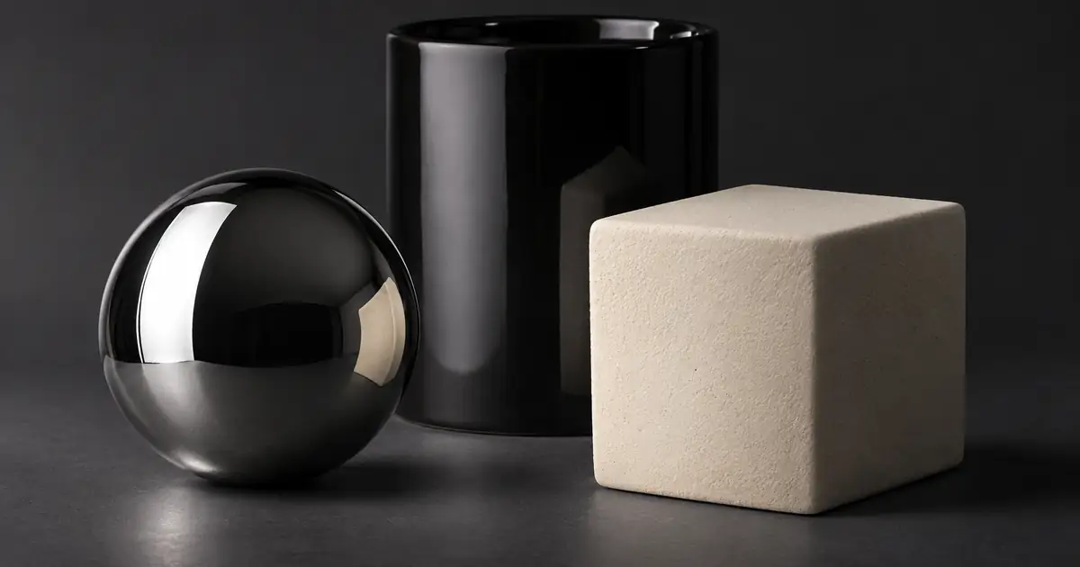

A shiny bottle with every reflection removed can look strangely flat. A matte jar with a hard white stripe can look like polished plastic. When a product image feels wrong, the problem is sometimes the way its material catches light rather than its color or background.
I recommend learning to read reflections before trying to erase them. The goal is to show a recognizable product with a readable label and believable surfaces. A controlled highlight can explain a curve, separate an edge, or tell a customer that the finish is glossy.
Specular and diffuse describe different reflection behavior
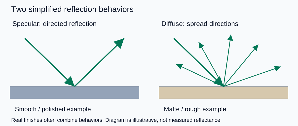
A specular reflection is directional and can preserve a recognizable image of a light source or surrounding object. Diffuse reflection spreads light across a range of directions. The LUCID lighting guide illustrates this basic distinction using smooth and rough surfaces.
Real packaging often combines both. A printed paper label, glossy coating, metal cap, and frosted glass body can respond differently within one photograph. Treating the whole bottle as a single “shiny object” makes the job harder because a useful adjustment for the cap may obscure the label.
The simplified diffuse and specular models in the University of Cambridge's rendering lecture help explain the difference. They are models, not a promise that every real material falls neatly into one category. For a creator, the useful question is where the bright shape comes from and what it tells the viewer.
Read the product in separate zones
Before moving a light, divide the frame into the parts that matter: the cap, shoulder, body, label, and base. For each part, write what a buyer needs to understand. A brushed metal cap should not look like mirror chrome. A frosted body should not become clear glass. A paper label should remain legible.
| Surface | Useful cue | Problem to investigate |
|---|---|---|
| Polished metal | Structured reflections that describe the form | A broad blank area that hides an edge |
| Glossy ceramic or plastic | A controlled highlight with the base color still visible | A white stripe crossing an important label |
| Matte paper or rough ceramic | Texture and gentle shading | A synthetic-looking polished coating |
| Glass or translucent packaging | Edges, reflections, and believable transmitted light | Missing walls, inconsistent refraction, or altered fill level |
This becomes a practical approval sheet. Instead of asking whether the image is “premium,” ask whether the cap finish matches the reference and whether the label reads at the intended display size. Those are decisions you can explain to a photographer, editor, or AI model.
Move the reflected shape before lowering everything
Imagine a black ceramic mug beside a window. A bright rectangular reflection covers the front. Reducing exposure may darken the entire mug while leaving the reflection in the same inconvenient place. My first move would be to change the relationship between the mug, camera, and bright window.
Rotate the mug slightly, move the camera a little, or change the position of the light if it is movable. Watch the reflection travel across the surface. Stop when it explains the curve without covering the important artwork. For a listing image, keep the approved product angle in mind; a hidden logo is not a successful fix just because the highlight looks better.
A larger diffuser can change the shape and apparent size of what a glossy object reflects. It does not make reflection disappear. Likewise, a dark card can introduce a dark reflection that defines an edge. Evaluate the resulting shape rather than assuming that “soft light” means “no bright areas.”
If you are working with jewelry, the scale and surrounding environment create additional challenges. The jewelry reflection guide goes deeper on that specific task. Here, the goal is to identify the behavior before choosing a specialized setup.
Try this three-surface exercise
Place a matte cardboard box, a glossy mug, and a clean metal spoon on the same table. Use one large window or one diffused light. Keep the camera fixed, and avoid direct sun for this first comparison so that the lighting is easier to manage.
- Photograph the three objects together. Set exposure so that important bright detail is not lost. Keep the original file.
- Move a white card beside the objects. Watch which surfaces show a recognizable bright shape and which show a broader lift in brightness.
- Replace it with a dark card. Notice where a dark boundary appears. Keep the card outside the image unless you are deliberately documenting the setup.
- Rotate one object. Leave the others still. Compare how quickly the visible reflection changes relative to its neighbors.
- Annotate the contact sheet. Mark one reflection that helps describe form and one that blocks useful detail.
You are not measuring reflectance, and the exercise does not rank materials. It teaches you to connect a visible highlight with something in the scene. Once you can do that, “remove the ugly glare” becomes a more precise instruction such as “move the window reflection off the printed name while retaining the curved highlight at the right edge.”
Use the material and highlight review sheet to record the object, finish, source position, useful cue, and next change. Keeping one variable per attempt makes the notes worth reusing.
Keep AI lighting edits material-specific
When I write a product-image brief, I separate material preservation from the lighting change. A broad request for a luxury look can add gloss where none belongs, alter the metal finish, or remove the small texture that makes an object recognizable.
Use the supplied jar photograph as the product reference. Preserve the matte paper label, frosted glass body, brushed metal lid, proportions, and existing lettering. Add one broad, controlled side reflection to describe the curve of the glass. Keep the label readable. Do not make the paper glossy, turn the brushed lid into mirror chrome, or remove the natural surface texture.
You can explore the scene in QuestStudio Image Lab, then compare each material zone with the original. A generated highlight is a design proposal, not evidence that a physical lighting arrangement will reproduce it. Reject attractive results that misrepresent the actual finish.
For a perfume bottle, also inspect the glass walls and liquid level. Reflection and transmission work together, so fixing a white stripe may reveal another problem rather than finish the image. Use the perfume photography workflow when those details are central to the shot.
Decide what to keep before retouching
My final check is simple: cover the label mentally and ask whether the materials still read correctly. Then look at the label itself at the actual delivery size. The image needs both believable form and usable information.
Do not remove a reflection just because it is bright. Keep it when it explains a curve or finish; move or reduce it when it hides a detail or competes with the product. That decision usually produces a more convincing photograph than trying to make every surface evenly lit.
Frequently asked questions
What is the difference between specular and diffuse reflection?
Specular reflection is directional and can show a recognizable light-source shape. Diffuse reflection spreads light over many directions. Real materials can combine both behaviors.
Does a softbox remove specular highlights?
No. A shiny object can reflect the softbox itself. Its size, position, and shape influence the visible highlight, so evaluate the reflection rather than assuming diffusion removes it.
Should I remove all reflections from a product photo?
No. Useful reflections explain curves, edges, and material finish. Prioritize moving reflections that hide important details while preserving the cues that make the product recognizable.
Will a polarizer fix every reflective product?
No. Results depend on the material, angles, and setup. A polarizer is not a universal replacement for controlling the surroundings and the position of reflected light sources.
How can I spot a misleading AI material edit?
Compare individual zones with the source photograph. Check whether matte paper gained gloss, brushed metal became mirror-like, glass walls changed, or the label and proportions drifted.
Technical references
Continue with a useful next step
 Image
AI Exploded View: Show Product Parts Without Inventing Them
Create a useful exploded-view product image from a verified part inventory, with clear spacing, plausible order, and a separate check for technical claims.
 Image
AI Product Catalog Consistency: A 100-SKU Workflow
Create consistent AI-assisted product images across 100 SKUs with a locked product specification, scene recipe, manifest, reference angles, acceptance criteria, and batch QA.
 Image
AI Product Photo Approval Checklist: Review Before You Publish
Check AI product photos against the exact SKU, work through a missing-component example, and use a downloadable approval log before publishing the final image.
Hero: AI-generated editorial illustration. Supporting diagrams and exercises: QuestStudio.